
.svg)
Sergio Mannino Studio
Architectural Branding
Architectural Branding
Brand identity design for Soho Greenhouse, a licensed cannabis dispensary in Soho, New York. Logo, color system, and brand guidelines developed as part of a full retail design concept on Broome Street.
Before we sketched a logo or chose a typeface, we sat down with the Soho Greenhouse team and mapped what the brand actually needed to be. Not what cannabis brands typically look like. What this one, on Broome Street in Soho, had to stand for.
We ran a brand discovery session, mapping the values the identity would need to carry. Quality, elegance, hospitality, education, community. A fairly ambitious list for an industry still figuring out what it wants to be. From those values we built a visual language that could hold all of them without collapsing into generic wellness aesthetics.
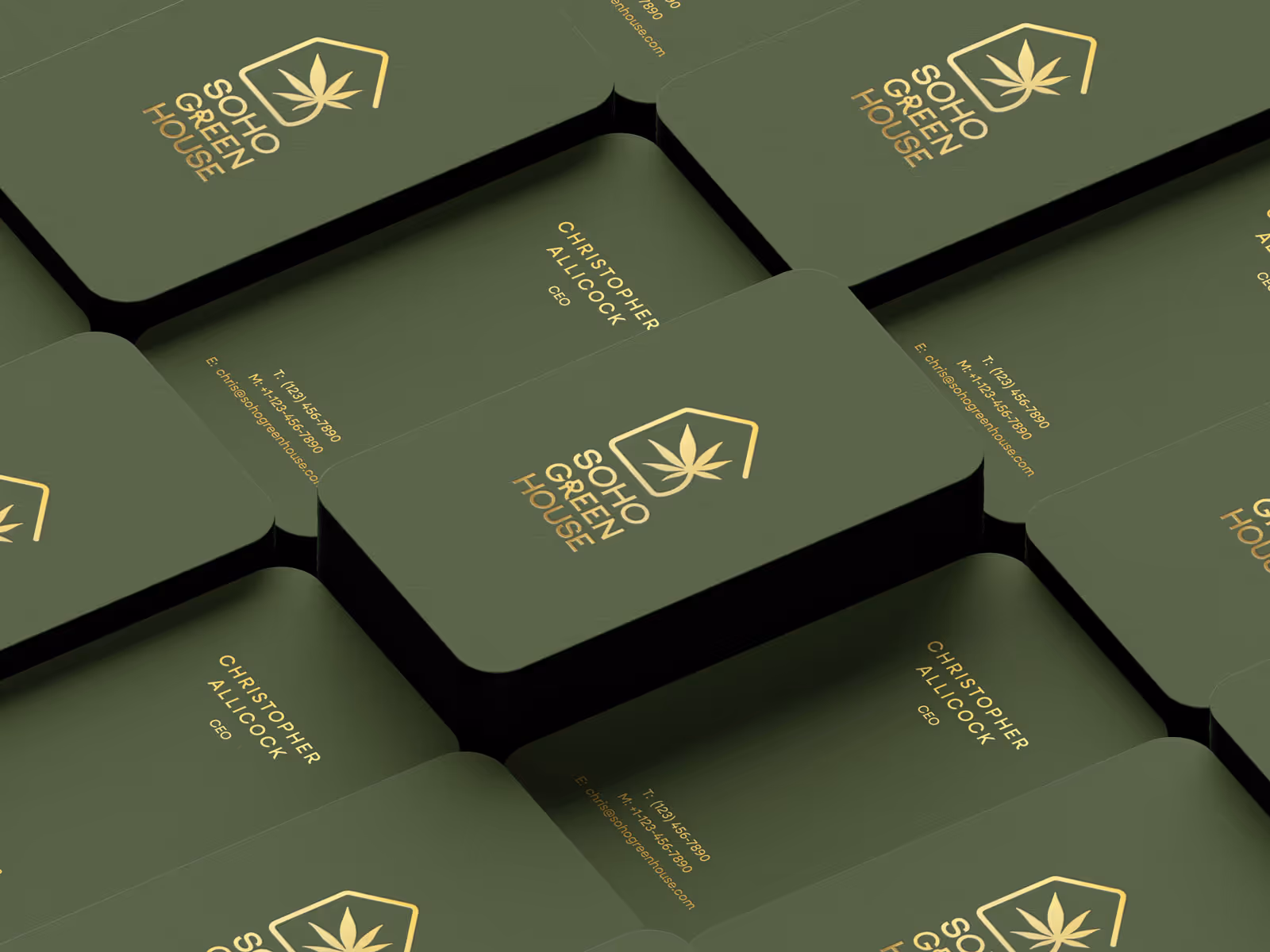
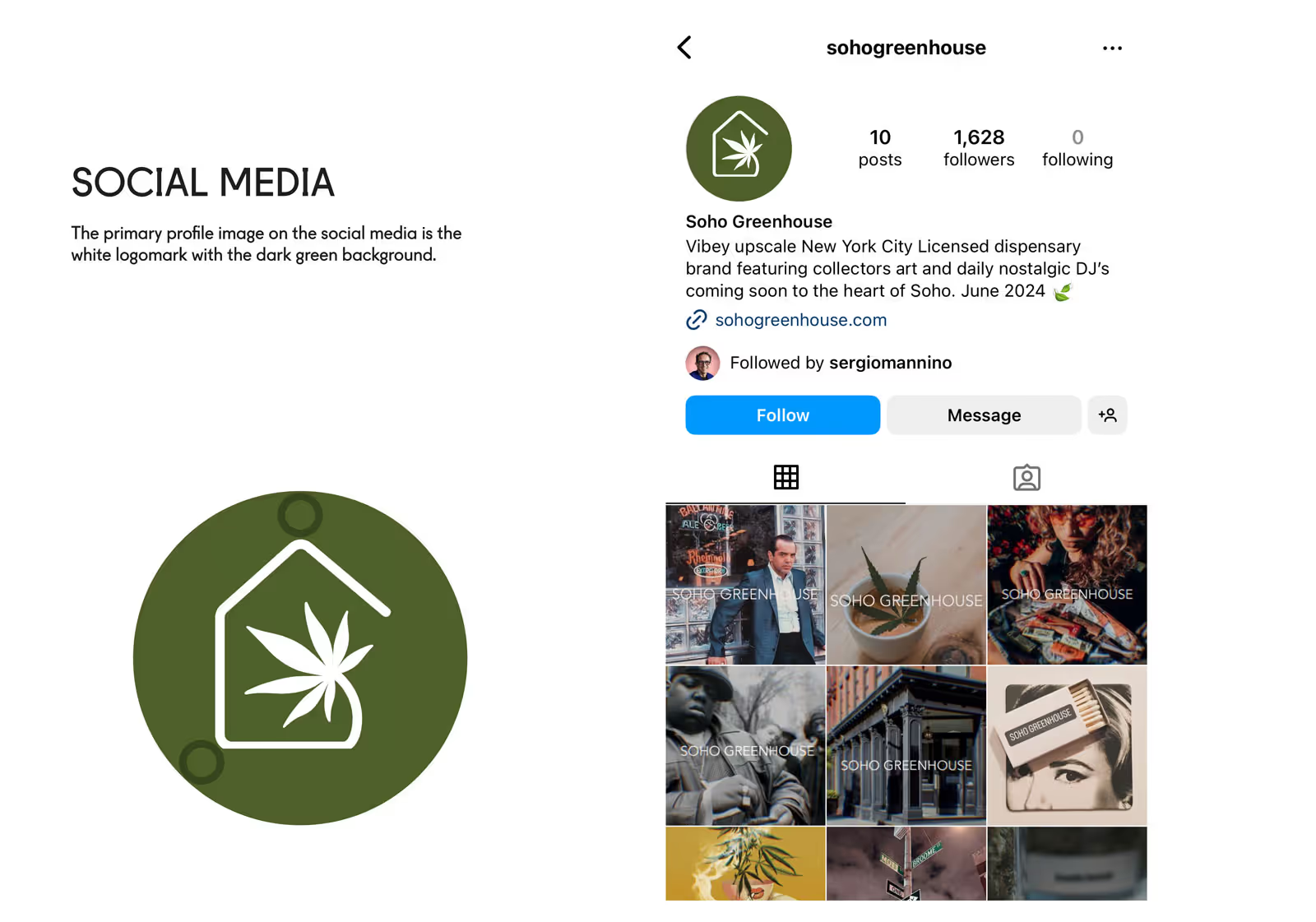
The logomark came out of a process we use to keep early design decisions honest. We identified every noun that could represent the brand, then traced which ones connected to multiple values at once. The greenhouse form, with its arched glass roof, emerged as the primary symbol: architecture as container, warmth as a structural idea. The cannabis leaf sits inside it, unambiguous but calm. The typeface Lena was selected exclusively for the logo, chosen for its balance of softness and structure. All supporting communications use Neulis Neue, keeping the system legible and modern without competing with the mark.
The color system anchored everything: Twist of Lime as the dominant ground, acid yellow as an active accent, gold foil for moments that needed weight, icy pink as a secondary note that kept the palette from reading as purely botanical. The combination avoids every visual trope the cannabis industry defaults to.
Brand guidelines were developed to carry the system across packaging, business cards, letterhead, envelopes, and digital assets. Each application follows the same logic. Nothing was added that the brand values couldn't justify.
This is architectural branding in its most literal sense: a brand identity that grew from the same spatial and material thinking that shaped the cannabis store design. The color decisions, the terrazzo pattern, the shelf composition in the dispensary all trace back to decisions made here, in the brand discovery phase, before a single surface was specified.


A strong cannabis brand identity begins with positioning. Before designing a logo, the brand must define its audience, tone, and market role — medical authority, lifestyle sophistication, or boutique premium. From there, typography, color systems, and visual symbols are developed to create a cohesive message and identity across packaging, digital platforms, and retail environments.
Cannabis branding operates within strict legal and cultural constraints. It must avoid prohibited claims, respect advertising limitations, and navigate lingering stigma. As a result, visual language is crucial. The most successful cannabis brands communicate trust, refinement, and clarity without relying on obvious leaf imagery or counterculture references.
Premium cannabis branding typically includes: a distinctive and scalable logo system; a controlled color palette that avoids cliché colors; refined typography; packaging design aligned with compliance regulations; clear brand guidelines for consistency; consistency across every touchpoint is what builds long-term recognition.
Start by reviewing case studies, not just portfolios. A strong agency demonstrates a clear strategy behind visual decisions, not only attractive graphics. Look for experience in regulated industries (even pharmaceutical), understanding of compliance constraints, and the ability to translate positioning into a complete visual system — logo, typography, packaging, and brand guidelines.
A cannabis brand designer should understand both cultural context and legal limitations. Ask whether they define positioning before designing, whether they provide scalable logo systems, and whether they build structured brand guidelines. A single logo file is not a brand.
Cannabis brands often operate in physical retail environments. Agencies with retail experience understand customer flow, perception, information hierarchy, and how identity translates into signage and packaging displays. This integration strengthens brand consistency across digital and physical touchpoints.
As legalization expands, differentiation becomes critical. Strong branding increases perceived value, customer trust, and long-term recognition. In crowded markets, clarity of identity often determines which brands scale and which disappear.
Brand development generally takes 8–16 weeks, depending on scope. Strategy and positioning come first, followed by research, development of visual identity and finally brand guidelines. This process can happen in parallel with the store design and can overalap.
Yes, in most cases an integrated studio creates stronger results. When branding and retail design are developed together, the identity is translated directly into spatial experience without interpretation gaps. A single studio aligns logo systems, color strategy, materials, signage, packaging, and the customer journey under a single conceptual framework. This ensures consistency across digital presence, packaging, and physical space. When two separate agencies work independently, the visual identity and the store environment often evolve in parallel rather than in dialogue. The result can feel disconnected — strong graphics paired with a generic interior, or a refined space carrying a brand that lacks clarity. In regulated industries like cannabis, cohesion also improves efficiency. Decisions about compliance, messaging hierarchy, and customer perception are made once, not negotiated between teams.
The studio works with cannabis clients across the U.S. and internationally. Location informs context, but strategy and design principles remain consistent.


.avif)