
.svg)
Sergio Mannino Studio
Architectural Branding
Architectural Branding

Angel Care Pharmacy’s brand identity, developed by Sergio Mannino Studio, is founded on the principles of care, community, and trust. With a clear mission to provide the best medical supplies and support, the brand embraces its role as a sanctuary for its community, offering hope, calm, and wellness. The brand’s logomark, featuring an angel wing, symbolizes protection and care, visually reinforcing the pharmacy’s commitment to looking after its neighborhood. The logotype, crafted in Nagoda Regular, combines a clean, approachable typeface with the essence of compassion and expertise. The design aims to be both soothing and professional, representing the pharmacy’s commitment to offering the best service and health solutions.
Angel Care Pharmacy's color palette blends soft,calming tones of mauve, white, and silver with the neutrality of gray andblack. Mauve, representing balance and tenderness, forms the central color,conveying warmth and peace. White adds an element of clarity, while silver tiesthe brand to knowledge and care. Together, these elements create an environmentthat is both welcoming and tranquil.
Our work extends to every touchpoint of the brand, frombusiness cards to letterheads, and even the interior design of the pharmacyitself, each designed with the utmost attention to detail. Every element,whether digital or print, reinforces Angel Care's core values—compassion,clarity, and commitment to service.


Because patients choose where to fill their prescriptions based on trust, and trust is built through every signal a business sends, starting with its name, logo, and visual presence. A generic pharmacy cross and clip-art typeface communicates that the brand hasn't thought carefully about its identity, making it harder to differentiate from chains and build loyalty. For Angel Care Pharmacy, Sergio Mannino Studio developed a complete brand identity rooted in the pharmacy's mission of community care and compassion, giving the business a visual language that patients could recognize and connect with from day one.
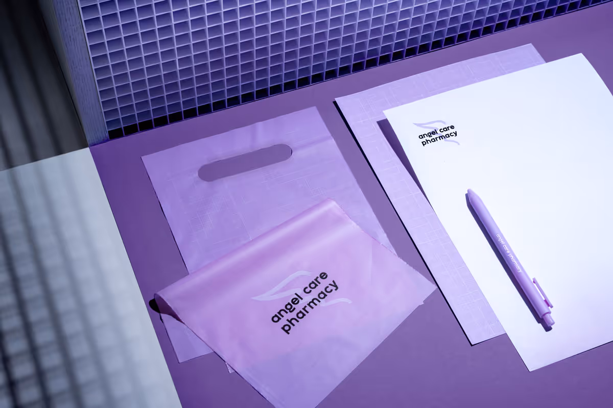
A complete brand identity for a pharmacy typically covers the logomark and logotype, a defined color palette, a typography system, a brand guidelines document, and applications across business stationery, such as business cards, letterhead, and envelopes. It may also extend to packaging design, marketing materials, and branded merchandise. For Angel Care Pharmacy, Sergio Mannino Studio delivered the full scope: logo, brand guidelines, business cards, letterhead, prescription vial design, bags, and marketing gadgets, all unified around a single visual concept.
You start with the brand's mission and values, then find a visual symbol that makes those tangible without being generic. Healthcare is full of overused symbols—crosses, caducei, hearts—that communicate category but nothing distinctive. For Angel Care Pharmacy, the logomark centers on an angel wing, a symbol chosen specifically to reflect the pharmacy's identity as a neighborhood sanctuary offering protection, hope, and care. The logotype, set in Nagoda Regular, was selected to balance approachability with professional credibility—warm but not informal.
A brand guidelines document codifies how the identity should be used across every application: logo variations and clear space rules, approved color palette with precise values, typography hierarchy, and usage examples. Without it, a brand erodes over time as different vendors, printers, and staff make inconsistent decisions. For a pharmacy building its reputation in a community, consistency is trust—every touchpoint should reinforce the same message. Sergio Mannino Studio produced a full brand guidelines document for Angel Care Pharmacy that covers all of these elements and gives the owner a clear reference for every future application.
Significantly. Color carries emotional weight before any other element is read. Blues and cool whites signal clinical reliability; warmer palettes (dusty pinks, soft neutrals, muted greens) signal human warmth and approachability. The right palette for an independent pharmacy depends entirely on the brand's positioning: a compounding pharmacy aiming at a clinical clientele makes different choices than a community pharmacy built around care and accessibility. Angel Care Pharmacy's palette was developed to feel soothing and trustworthy simultaneously, professional without being cold.
Packaging is one of the most repeated brand touchpoints a pharmacy has: every filled prescription is an opportunity to communicate who you are. Generic white vials and plastic bags say nothing. Designed packaging with consistent typography, color, and logomark application turns every dispensed prescription into a brand impression. Angel Care Pharmacy went further by adopting compostable vials and bags instead of plastic, with packaging designed by Sergio Mannino Studio to make that sustainability commitment visible, turning an operational choice into a brand statement that patients notice and remember.
A logomark is the symbolic icon, an image or shape that represents the brand visually. A logotype is the typographic treatment of the brand name. Together they form the full logo system. Having both gives a brand flexibility: the full logo for primary use, the mark alone for applications where space is limited:vial caps, embossed stationery, app icons, signage. For Angel Care Pharmacy, the angel wing logomark and the Nagoda Regular logotype were designed to work together and independently, giving the brand a versatile identity system rather than a single rigid lockup.
Yes, and it's most effective when the sustainability messaging is designed into the identity system rather than added as a disclaimer. When the packaging itself is compostable and the design makes that choice legible and intentional, the pharmacy's values become part of the experience rather than a marketing claim. Sergio Mannino Studio integrated Angel Care Pharmacy's sustainability commitment directly into the packaging design, creating a coherent visual statement that reinforces the brand's mission every time a prescription is dispensed.
Before opening, if possible, and certainly before any signage, packaging, or marketing materials are ordered. Rebranding after the fact is more expensive and disruptive than getting it right at the start because it requires replacing everything produced under the old identity. More importantly, launching with a strong, coherent brand identity means every early patient interaction builds recognition in the right direction. First impressions in a new neighborhood compound quickly, for better or worse.
Studios that understand both brand strategy and the specific context of healthcare retail are best suited for this work: the stakes around trust, credibility, and community perception are higher than in most consumer categories. Sergio Mannino Studio is a Brooklyn-based architectural branding firm with direct experience in pharmacy brand identity, including the complete identity system for Angel Care Pharmacy: logomark, logotype, color palette, typography, brand guidelines, stationery, packaging, and marketing materials, all built around the pharmacy's mission of community care and compassion.


.avif)