
.svg)
Sergio Mannino Studio
Architectural Branding
Architectural Branding
.avif)
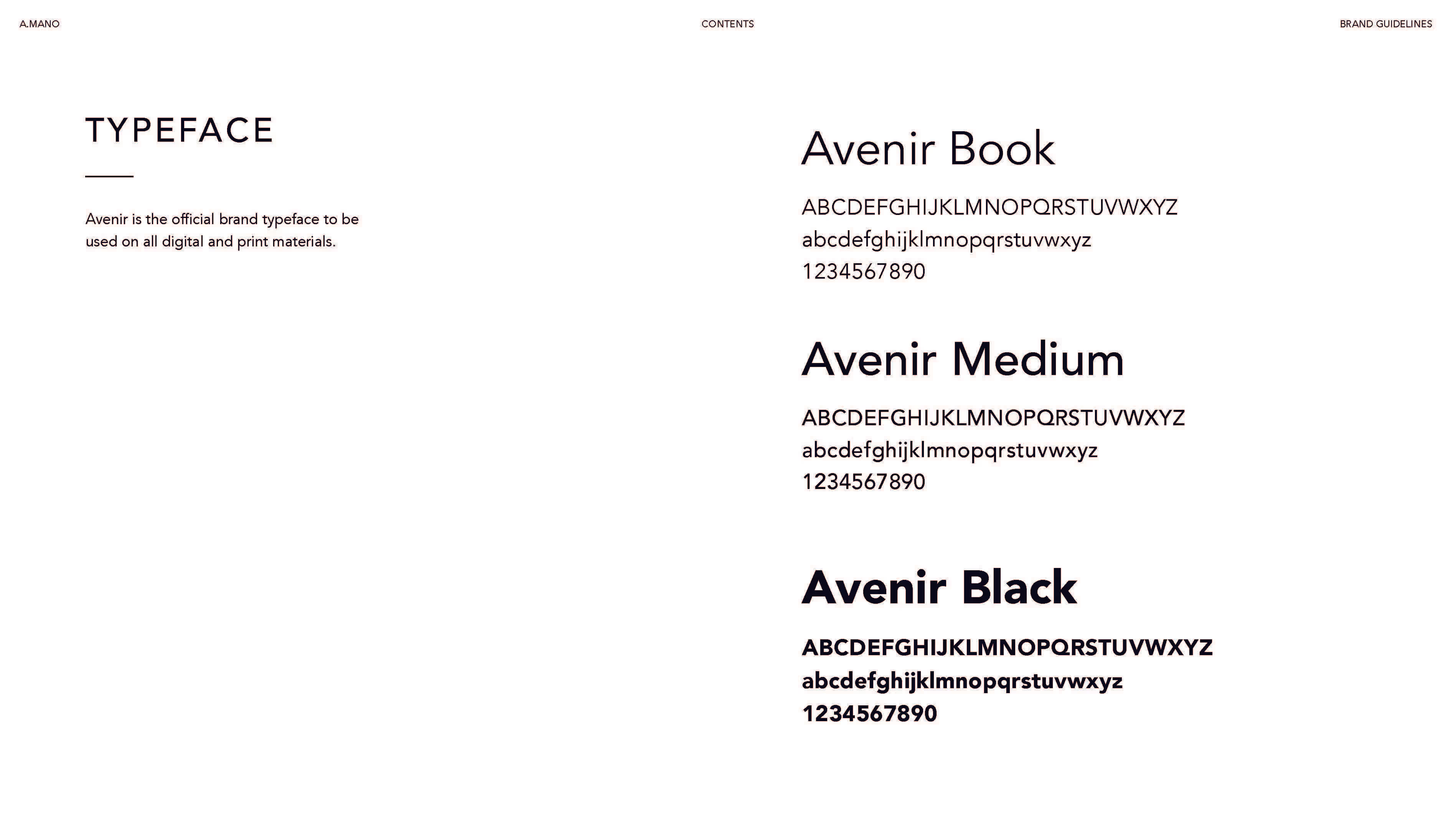
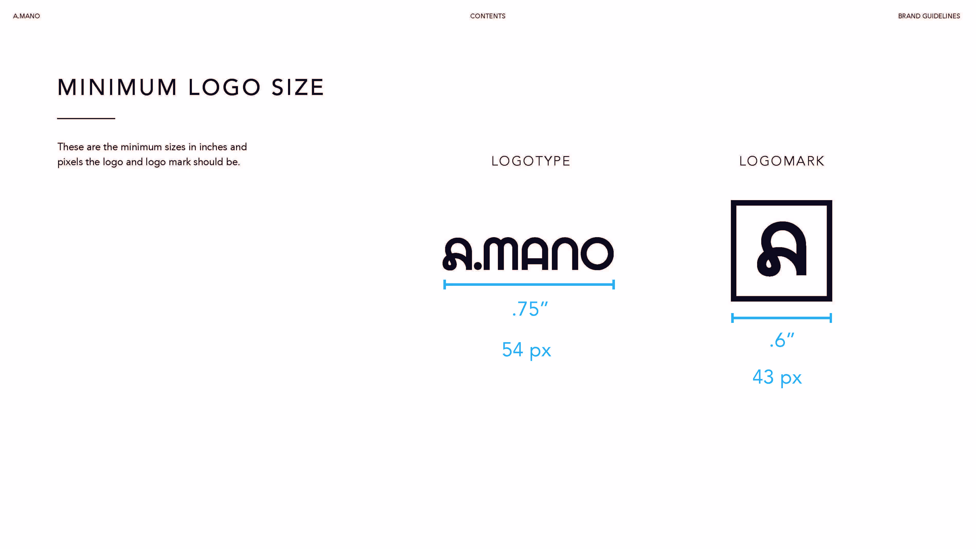
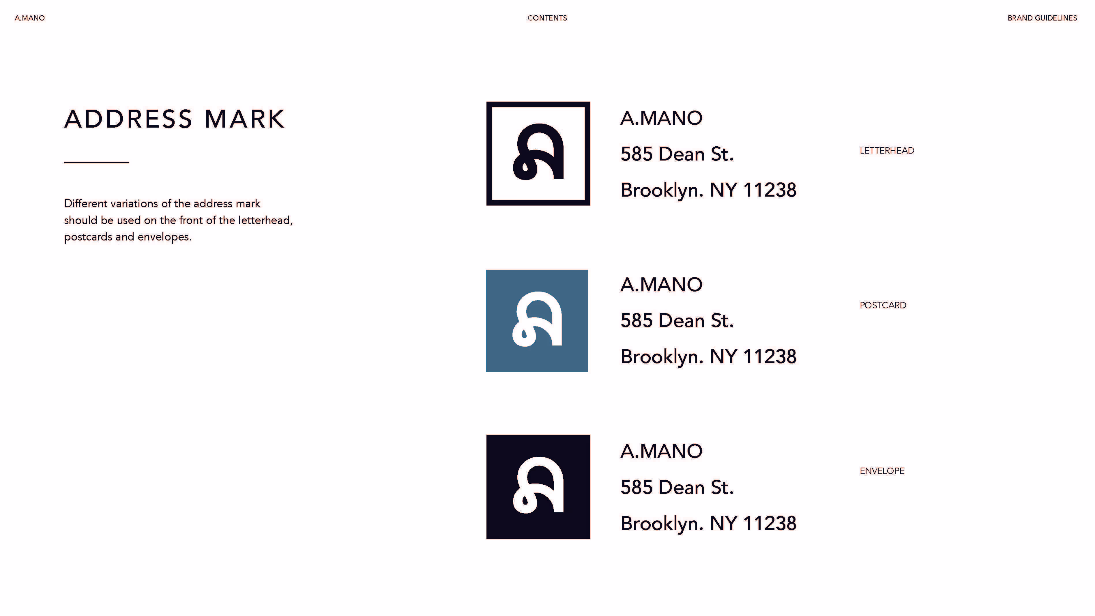
Brand identity for A.MANO, a Brooklyn-based brand that embodies the perfect fusion of local craftsmanship and contemporary design. A.MANO’s ethos revolves around quality, elegance, and a distinct sense of place, which is reflected in every detail of its brand. The logo serves as the foundation of the identity, inspired by the architectural features of A.MANO’s Brooklyn space. A unique typographic system, paired with the Avenir font family, creates a clean, timeless aesthetic, enhancing both digital and print materials. The logo’s simple yet powerful design, which incorporates a square and stylized "A", forms a visual connection to the community-focused, urban feel of the brand.
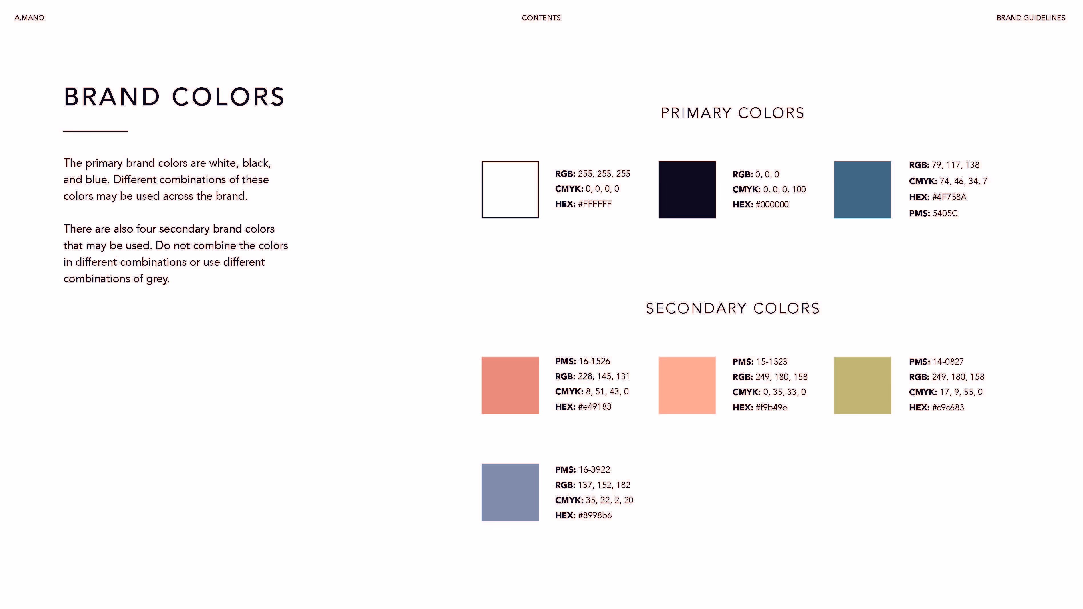
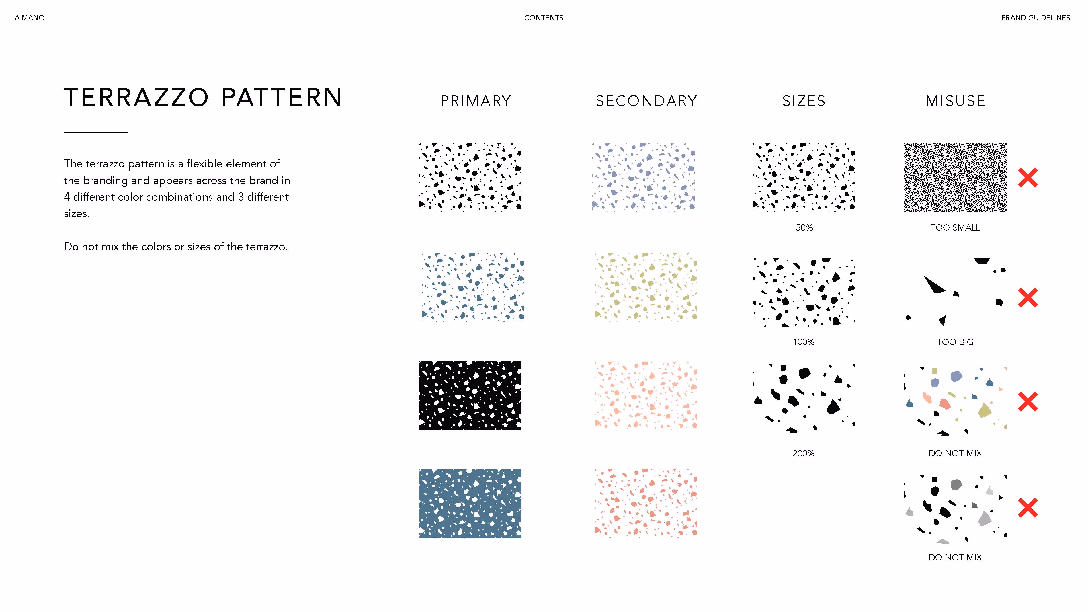
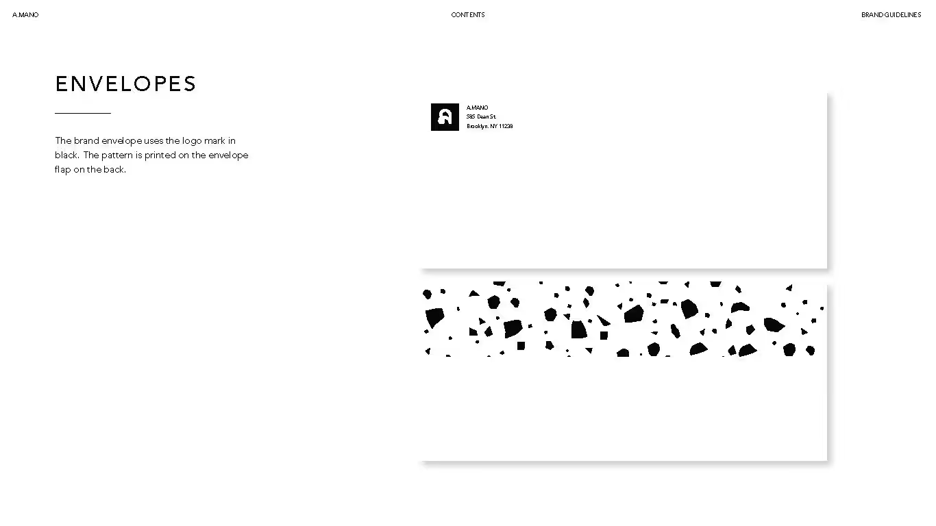
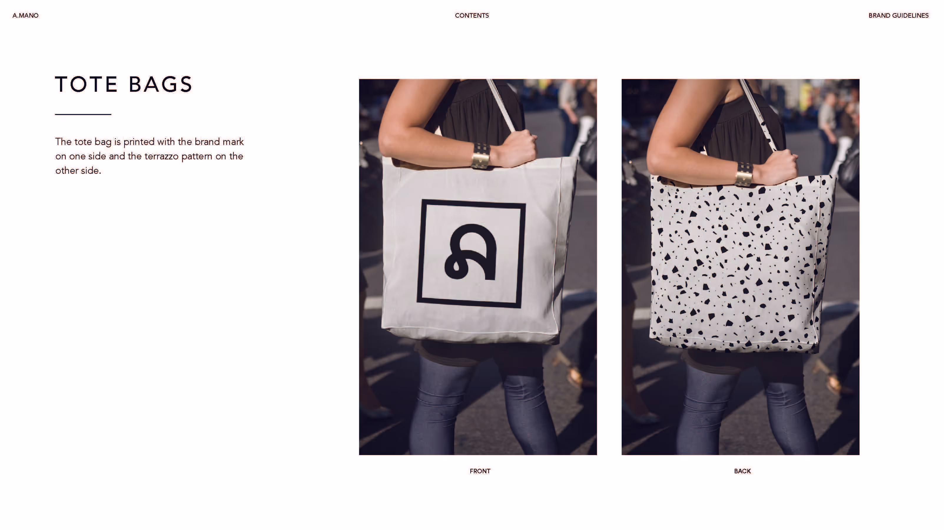
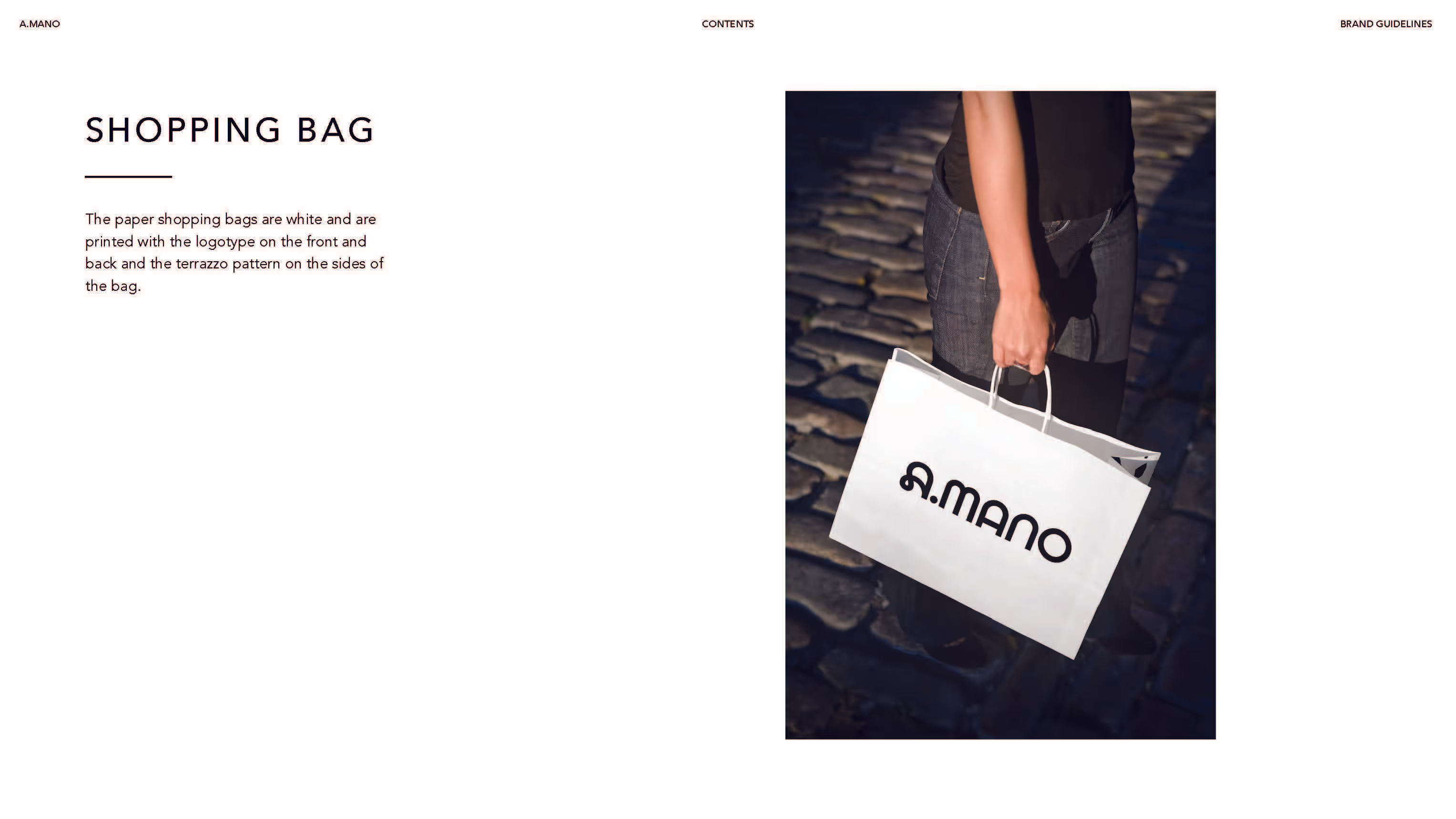
The color palette balances classic and contemporary. Primary hues of black, white, and blue are complemented by softer secondary colors, bringing warmth and depth to the overall look. The terrazzo pattern, a key design element, brings texture and playfulness to everything from business cards to packaging.
Every element is designed to reflect the brand’s core values: craftsmanship, simplicity, and a deep connection to the community.
.avif)
.avif)
.avif)
.avif)
.avif)
.avif)
.avif)
.avif)


