
.svg)
Sergio Mannino Studio
Architectural Branding
Architectural Branding
This conceptual cannabis dispensary design by Sergio Mannino Studio challenges the clichés of retail interiors, offering a fresh and vibrant alternative. Instead of the usual blend, cheap atmosphere, the space is alive with bold colors, sculptural forms, and a seamless customer flow. By integrating branding, architecture, and interior design from the ground up, this project presents a new standard for cannabis retail design — open, accessible, and unmistakably contemporary.
Cannabis retail in New York arrived fast. Most dispensaries responded by playing it safe or without elegance. Soho Greenhouse wanted to open on Broome Street in Soho and feel like it belonged there. That meant committing to a point of view.
The retail design started with the brand. The identity we developed for Soho Greenhouse, built around elegance, hospitality, and education, set the palette and the attitude. Olive green, acid yellow, dusty rose, natural oak, terrazzo in warm tones, red as a punctuation mark. The store had to make those choices physical.
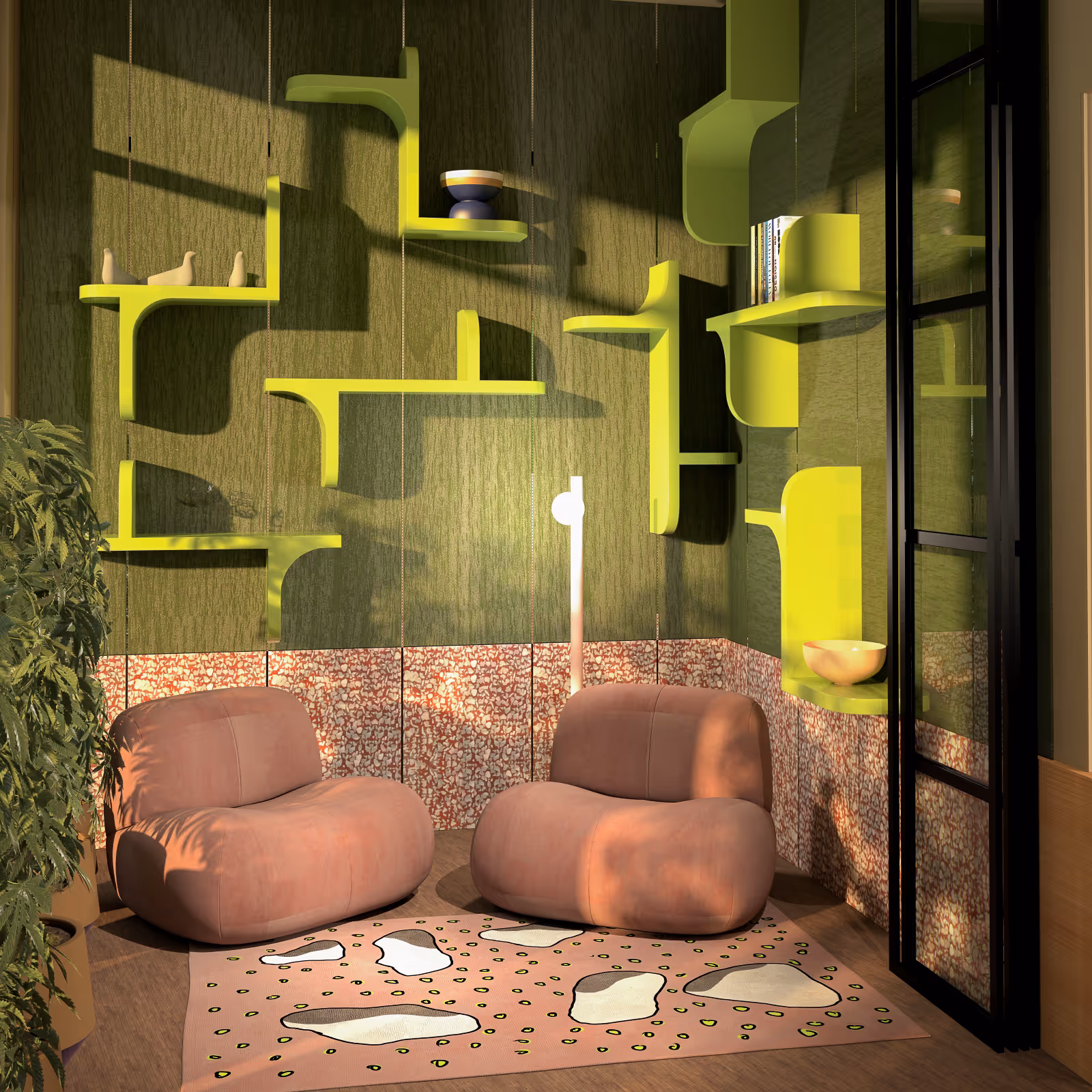
The lounge corner anchors the experience. Two low, rounded armchairs in dusty rose sit on a patterned rug, backed by a deep green textured wall where acid-yellow shelves float in an irregular composition. A terrazzo base panel in pink and red runs below, adding texture at eye level when seated. It reads like a room someone actually designed, not assembled.
The product wall runs the full length of the space: floor-to-ceiling lime green shelving alternating between open display, ribbed glass-doored sections, and patterned terrazzo panels. The zigzag edge detail on the shelf units gives the whole thing a handmade quality that the brand's elegance value needed to earn. A rolling ladder gives access to the upper shelves.
The cash wrap sits at the center, a lime green shelving and display structure with ribbed glass, a tiled counter top in green mosaic, and the logo applied to the back panel. Red bar accents on a vertical element cut through the green. The oak base cabinet below runs the full width, with round knob hardware that keeps the materiality warm.
In front of it, a cluster of organic oak display tables at varying heights, with terrazzo tops in the brand's pink and green tones, holds live cannabis plants among the product. The storefront reads from the street through a large gridded glass facade, plants and shelving visible from outside, which is its own kind of advertising.
The Soho Greenhouse cannabis cannabis brand identity was developed alongside the space, and the two inform each other in ways that are hard to separate. The color decisions, the terrazzo pattern, the shelf composition, all of it traces back to a brand discovery session and a set of values the client committed to before a single surface was specified.
The project didn't get built. But the design thinking behind it applies directly to how we approach any retail space where trust between brand and customer has to be earned from scratch.


A strong cannabis dispensary design integrates brand identity, spatial layout, lighting strategy, and regulatory compliance into one cohesive environment. The store must communicate trust, clarity, and legitimacy while supporting customer education and product exploration. Design decisions should reinforce brand positioning rather than rely on generic retail templates.
Premium dispensary design focuses on proportion, materials, lighting, and spatial clarity. Instead of dark or transactional environments, high-end cannabis stores use refined finishes, controlled color palettes, and intentional circulation to create a sense of confidence and comfort. A premium space signals product quality through architecture and detailing.
An effective dispensary layout includes: a clear decompression zone at entry; intuitive circulation paths; secure yet accessible product display; consultation areas for education; and efficient checkout placement. The layout should reduce friction while supporting compliance and security requirements.
Cannabis retail design improves customer experience by reducing confusion, enhancing visibility, and creating an atmosphere of legitimacy. Clear sightlines, natural movement patterns, and well-lit product presentation help customers feel comfortable, informed, and confident in their decisions.
Branding gives the dispensary architectural coherence. Materials, color, signage, and lighting should express the same identity developed in the visual system. Without alignment between brand and interior, the store risks feeling generic or disconnected from its own messaging.
Materials should balance durability, compliance, and perception. Natural woods, metal details, glass displays, and textured surfaces often create warmth and transparency. Overly industrial or overly clinical finishes can undermine brand positioning unless intentionally aligned with strategy. Ultimately, materials should be chosen for their message and alignment with the brand's values. Each color and material carries significance and should be chosen accurately.
Compliance is integrated into the design process from the beginning. Security cameras, controlled access points, storage requirements, and ADA standards are incorporated architecturally rather than added as afterthoughts. When planned early, regulation supports clarity instead of restricting creativity.
Cannabis retail design operates within strict legal frameworks and heightened public scrutiny. The space must balance openness with security and education with efficiency. Unlike conventional retail, customer trust and regulatory clarity are central design parameters.
A dispensary project typically takes 2–6 months, depending on scope and permitting. Early collaboration between branding, architecture, and compliance consultants shortens the process and reduces costly revisions.
Yes. When branding and retail architecture are developed by the same studio, the space becomes a direct physical expression of the identity. Logo systems, color strategy, signage, materials, and customer journey evolve from a unified concept. Separate agencies often work sequentially, which can create inconsistencies between graphic identity and spatial experience. An integrated approach improves cohesion, efficiency, and long-term brand clarity.


08a%20.avif)
