.svg)

Most pharmacies in America are designed by following a checklist instead of a real concept. If you walk into a CVS, Walgreens, or Duane Reade, you'll probably feel a bit anxious, a little confused, and want to leave quickly.
These problems come from design choices made by committees, without thinking about the customers. There are harsh fluorescent lights, endless aisles of similar products, and a high counter that separates you from the pharmacist. Promotional signs cover every surface. The main message in most pharmacies is clear: you're just a transaction, so get what you need and leave.
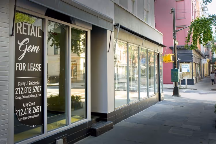
For independent pharmacies and the new generation of customer-centric pharmacy brands, this is both a problem and an opportunity. The problem is that most people's baseline expectation of a pharmacy is deeply negative. The opportunity is that the bar for doing something meaningfully better is extraordinarily low.
I've designed pharmacy interiors for over a decade, and what I learned from that work applies to any pharmacy that wants to build genuine customer loyalty rather than grudging repeat visits.
Why pharmacy design is different from other retail
Most retail design is about creating desire. Stores try to make you want their products, the lifestyle they represent, or the person you could become by buying them. The goal is to move you from feeling neutral to feeling inspired.
Pharmacy design runs a different arc. Most customers arrive in a state of need or in a state of anxiety, caring for someone else, navigating a health system that has made them feel small. They are not in the mood to be seduced because they need help. They also need, and deserve, to feel human while they get it.
This means the first job of pharmacy design is reassurance. Before a pharmacy environment can create loyalty, it has to undo the damage that most healthcare environments have already done. In the first seconds of the customer's experience, it has to communicate that you are in good hands, you are seen, and that this will be okay.
Everything else, branding, product displays, and service design, should come after you've made customers feel comfortable.
The four design failures that cost pharmacies customers
1. Fluorescent lighting
Fluorescent lighting, or modern LED panels, is cheap and bright, but it often makes people look and feel a bit unwell. In healthcare settings, where patients may already feel anxious or sick, it's an especially bad option.
Lighting is one of the most powerful tools in retail design: it shapes mood, affects perception of color and material, and communicates more subliminally than almost any other design element. A pharmacy that invests in warm, layered, human lighting immediately distinguishes itself from every competitor the patient has ever visited.
You don't need fancy lighting design. Just choose warm lights instead of harsh ones, use a mix of general and focused lighting instead of lighting everything the same way, and pay attention to the quality of light during key moments like consultations, checkout, or when a patient looks in the mirror.
2. Visual noise
The traditional pharmacy merchandising model is built on density. Every surface is filled with product. Every product has signage. Every sign is competing for attention. The cumulative effect is a space that is visually exhausting and one that requires constant cognitive effort to navigate. It has almost no moments of rest, and that's why you want to get what you need and leave as soon as you can.
This approach made sense when pharmacies competed mainly on the number of products they offered and their prices. Back then, the goal was to show as much inventory as possible to as many people as possible.
In today's world, this approach no longer makes sense. We have Amazon for that.
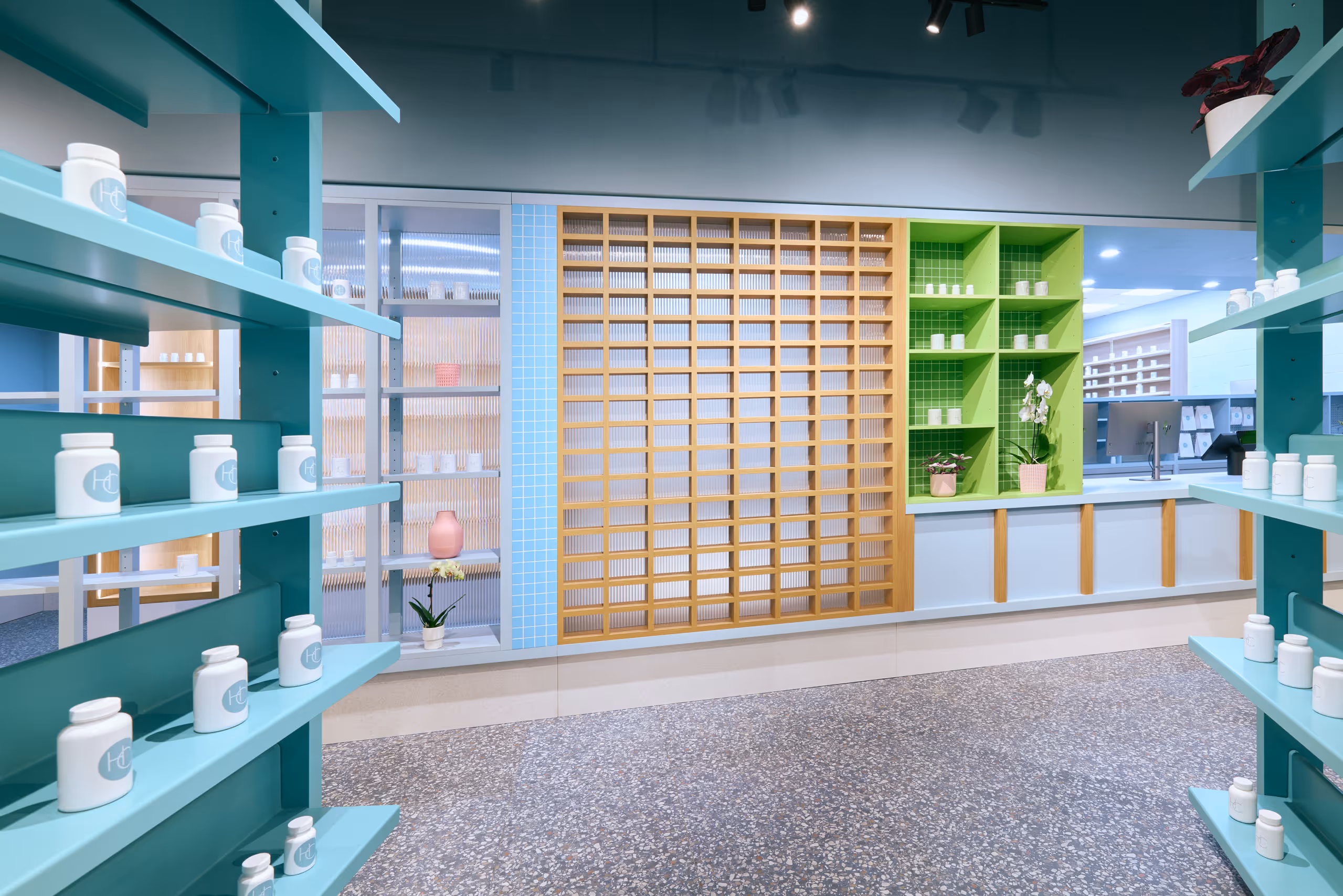
A pharmacy that edits its environment, that has negative space, that allows the eye to rest, that presents products with enough breathing room to feel considered rather than crammed, communicates differently. What you perceive is the feeling that they thought carefully about what belongs here. That thoughtfulness transfers, subliminally, to the customer's sense of the quality of care she's receiving.
Editing the products matters as much as editing the space. I've seen young people scanning moisturizing creams one after another in frustration with their Yuka app, searching for something free of harmful chemicals. Why not just carry products that pass that test? A pharmacy that curates its shelves around safety and quality is making an argument about what it stands for. That argument is visible the moment you walk in.
3. No privacy
I remember standing at a pharmacy counter once, waiting, while the person ahead of me quietly told the pharmacist the name of the medication he needed. I wasn't trying to listen. Everyone around us heard anyway.
Patients filling prescriptions for mental health medications, HIV treatments, fertility drugs, or addiction management are sharing private information in a public space. Most pharmacy designs treat this as someone else's problem. It isn't.
A dedicated consultation space, even a small alcove, even a partial enclosure, changes everything about that interaction. The conversations that happen in a private space are different from the ones that happen at an open counter. More honest. More useful. That's the whole point of going to a pharmacist rather than ordering online.
4. No sense of brand
Most independent pharmacies look like a slightly smaller, slightly sadder version of a CVS. Same shelving systems, same layout logic, different name on the door.
Every time a patient walks in and feels nothing particular, that's a missed opportunity that compounds over years. People don't build loyalty to a generic space. They build loyalty to a place that feels like someone made decisions, had a point of view, cared about what it looked like to walk in the door.
A distinct environment is a retention strategy. One of the cheapest ones available, in the long run.
What a well-designed pharmacy communicates
Careland was on the corner of Clark and Henry in Brooklyn Heights. The floor was covered in band-aids, hand-drawn by me in that slightly obsessive way I draw when I'm not thinking too much. The shelving curved for seventy feet along one wall. Everything was bright green, pushed almost to the point where it stops reading as pharmacy and starts reading as something else entirely. For Medly we used a buffed cement counter and tiles by Jamie Hayon, aqua and white, small and intimate. For Angel Care in Philadelphia, the palette was mauve and silver, Artemide lamps, and a pair of Sottsass side tables from the Memphis collection.
Three very different spaces, each one starting from a real question about who was coming through the door and what they needed to feel when they got there. The Careland floor made people smile. I didn't plan that exactly. I drew band-aids because it felt right. But people smiled, and then they relaxed, and then they talked.
A space that makes you feel something is a space you go back to.
What to ask a designer before commissioning a pharmacy interior
"How many pharmacy interiors have you designed, and can I visit one?"
Pharmacy design has specific operational, regulatory, and human requirements that general retail designers often don't know about. A designer without pharmacy experience will learn on your project. You'll pay for that education. Visit actual completed projects before you commit.
"How do you think about the patient experience rather than the customer experience?"
A customer is in a buying mindset. A patient is in a care mindset. A designer who talks exclusively about dwell time and basket size, without addressing what it feels like to be sick and scared in a public space, is using the wrong framework.
"How do you balance brand expression with clinical compliance?"
Pharmacies operate under significant regulatory requirements: privacy laws, dispensing regulations, ADA compliance, signage rules. A designer who doesn't know these will either produce something beautiful that fails inspection, or something compliant that gave up everything interesting to get there. The best pharmacy designers treat constraints as part of the design problem, not an obstacle to it.
Frequently asked questions
How much does pharmacy interior design cost? For an independent pharmacy, expect a total investment of $150,000 to $600,000 depending on size, location, and scope. New York City costs run higher than national averages. The design fee alone typically ranges from $30,000 to $120,000.
How long does a pharmacy interior design project take? From initial engagement to opening, plan for five to nine months for a typical independent pharmacy. This includes design development (eight to twelve weeks), permitting (four to eight weeks in NYC), and construction (eight to fourteen weeks).
Do pharmacy interiors require special permits beyond standard retail? Yes. Depending on location and scope, pharmacy projects may require Board of Pharmacy approvals, specific ventilation requirements for compounding areas, ADA compliance documentation, and Department of Buildings permits for any structural or mechanical changes. Working with a designer who has pharmacy experience significantly reduces the risk of costly compliance surprises.
Can an existing pharmacy be redesigned without closing? Often yes, with phased construction. We've managed pharmacy redesigns that kept the dispensing operation running throughout construction by sequencing the work carefully. This requires more planning upfront and adds some cost, but it's usually preferable to the revenue loss of a full closure.
What is the single highest-impact change an existing pharmacy can make? The space is always communicating something, whether you planned it or not. The lighting, the materials, the shelving, the colors, the smell, all of it adds up to a feeling that hits the customer the moment they step in. Reassuring or clinical. Edgy or organic. Trustworthy or transactional. That subliminal message is the most powerful design tool available, and most pharmacies leave it completely to chance. Getting intentional about it, deciding what you want people to feel and then making every decision in service of that, is the change that moves everything else.
.avif)