
.svg)
Sergio Mannino Studio
Architectural Branding
Architectural Branding

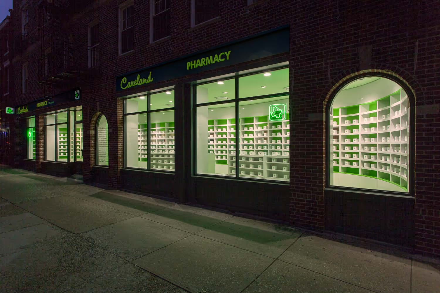
Sergio Mannino of his namesake New York City-based retail design firm Sergio Mannino Studio has completed a new, boutique pharmacy in Brooklyn Heights, a residential neighborhood within the New York City borough of Brooklyn.
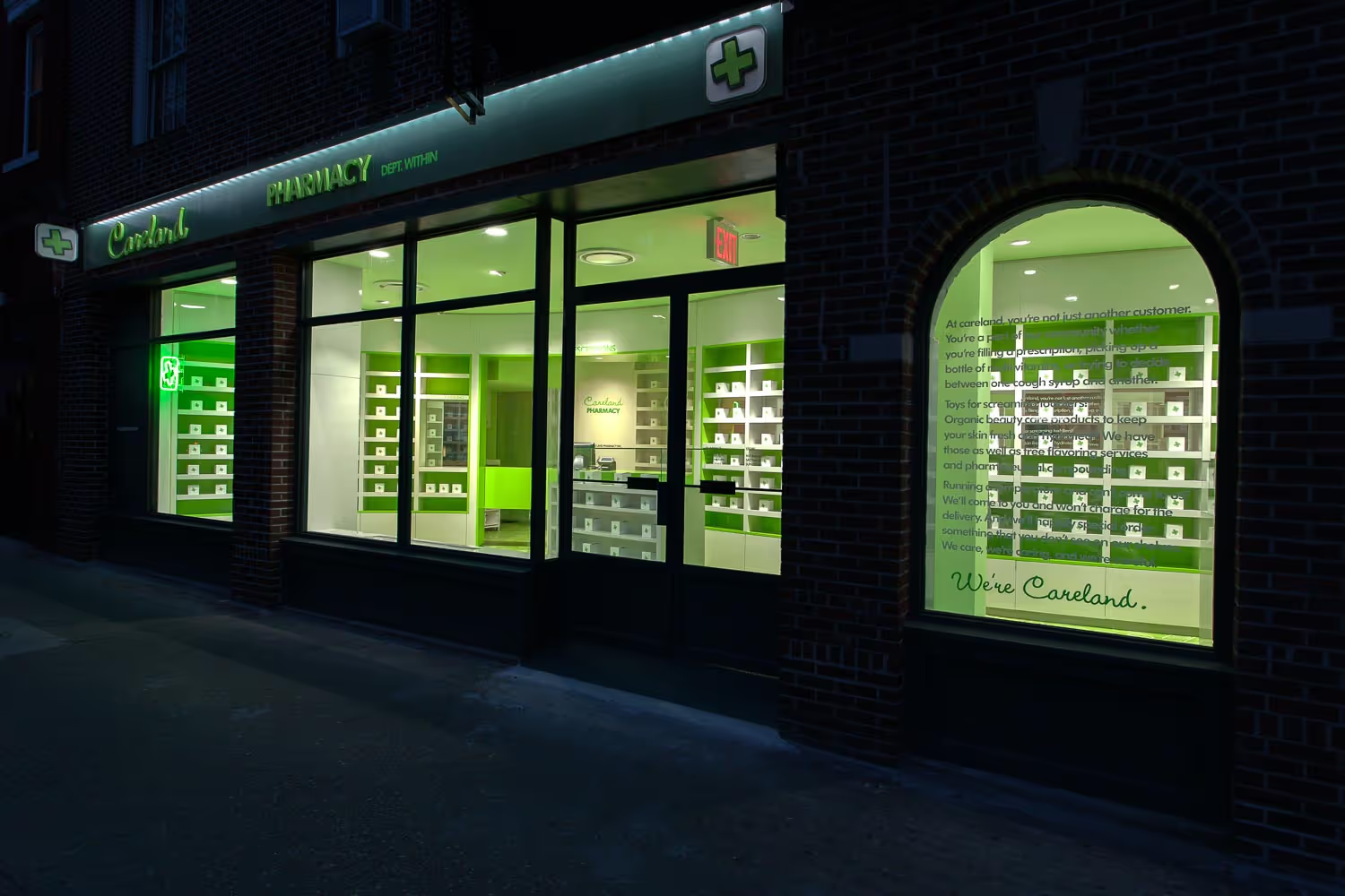
Mannino collaborated with Jonathan Wajskol of New York-based strategic design agency, designwajskol, to transform the ground floor of a landmarked building into a community-driven store. Located on the corner of Clark and Henry Street, Careland provides the neighborhood with access to prescriptions and over-the-counter medications, toiletries and beauty supplies, toys, and stationery. Careland Pharmacy blends traditional healthcare design with a fun, contemporary aesthetic, creating a warm shopping environment that caters to Brooklyn Heights residents. Existing brick along the façade was repurposed and painted white, and neon signage created by Wajskol welcomes customers inside.
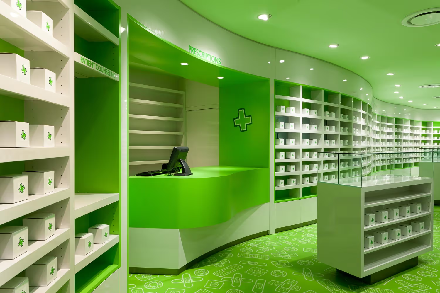
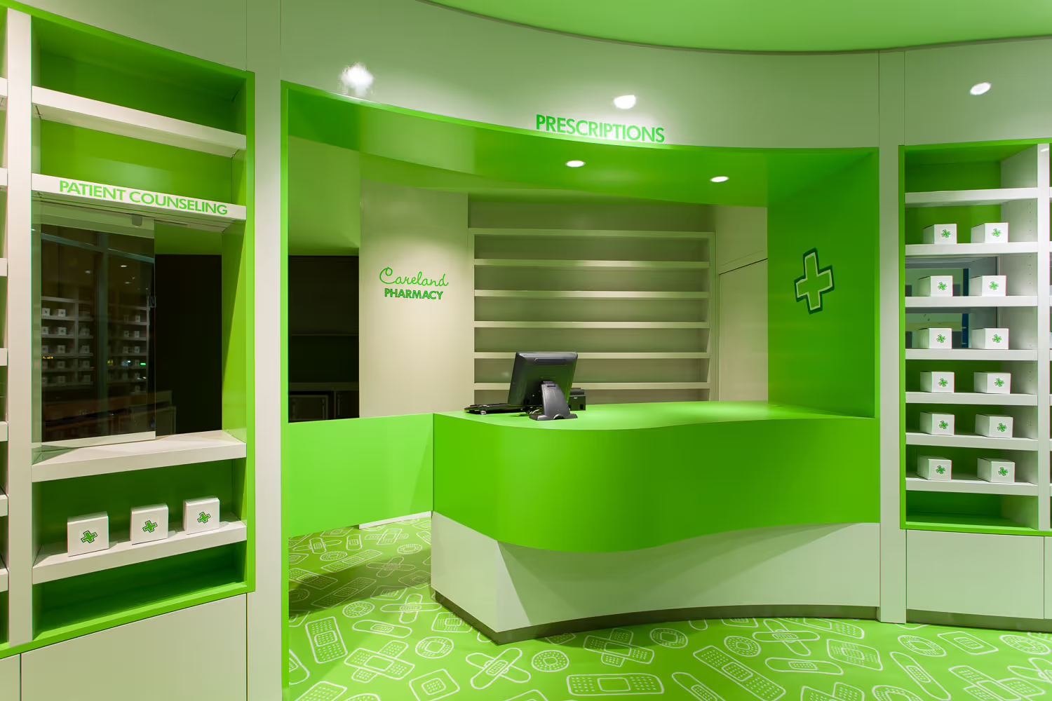
Mannino, who is best known for his work with companies such as Vince Camuto and Jessica Simpson, designed a clean layout that maximizes the space’s long storefront, making the vibrant interior visible from the street. Shelving displays are built into a long, curved wall that envelops customers when they enter. Mannino crafted unique, interchangeable shelving that allows Careland pharmacists to easily manage products, ensuring accessibility for customers while bringing a visually pleasing design to the space. Other offerings include a drop-off box that is available from the exterior for on-the-go customers needing to fulfill prescriptions
Color and playful graphics are at the heart of Mannino’s concept for Careland Pharmacy’s warm, playful interior. A cheerful, bright green color palette is found throughout the store, updating the classic dark green that is associated with pharmacies around the world. To complement the green hue, Mannino hand sketched a pattern of band-aids in varying shapes and sizes and photoshopped and digitally printed them on the vinyl floor.
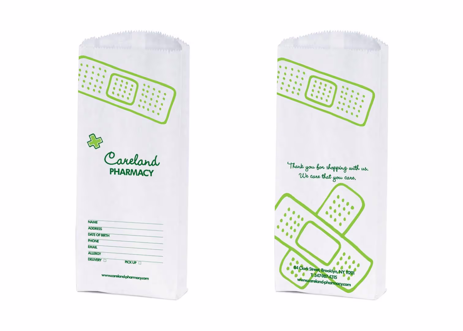
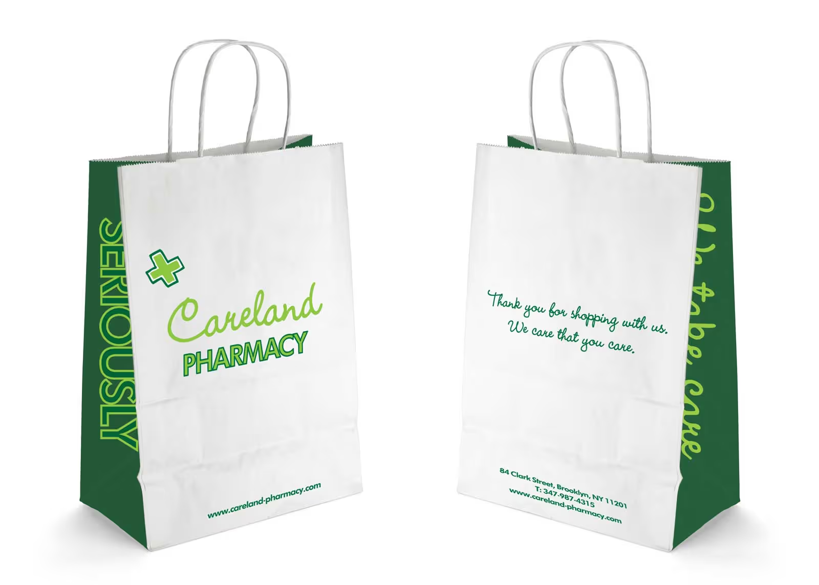
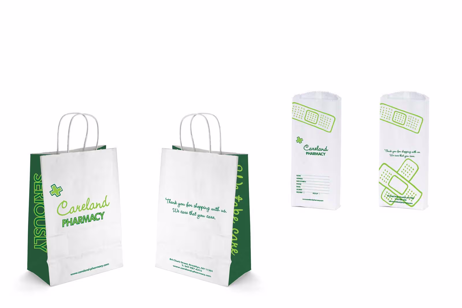
Mannino and Wajskol also crafted a custom graphic for Careland’s cross, a universal symbol for pharmacies, that can be found on the wall by the cash register and even on Careland’s prescription and shopping bags. The pharmacy bags, with graphics designed by Wajskol, blend the brand’s dedication to health and wellness with the playful design elements of the store.
Pharmacy Store Design Firm:
Sergio Mannino Studio
Visual Identity: designwajskol
Photography: Sergio Mannino Studio and Max Bolzonella
Area: 1,100sqft


By using the constraints as design opportunities. Careland is in a long, narrow storefront. The solution was a curved wall that envelops customers when they enter, with custom shelving built into it. The curve creates visual flow and guides movement naturally without looking boring. The layout maximizes storefront transparency, allowing you to see the vibrant interior from the street.
Transparency. Color. Visual drama. Most independent pharmacies hide behind product clutter, thinking the storefront is a place to showcase their products. The truth is, pharmacies don’t need to showcase anything in the windows. You cannot put a box of Tylenol out there thinking people will see it and come in; you are not selling fancy shoes! We wanted Careland to announce itself through design. The storefront is for people to see inside. Period. If you cannot do that, print a very large, very cool image of a medicinal herb or something fun. Just don’t line up adult diapers on the windows, please. Show them something worth seeing.
Custom details. Bold decisions. A point of view. At Careland, we hand-sketched a pattern of band-aids in varying shapes and sizes, then printed it on the vinyl floor. It’s witty, playful, unmistakably Careland. It takes a universal healthcare symbol and makes it joyful instead of clinical. This kind of detail makes a space memorable. It shows that someone thought about every surface, every moment. Design should improve everyday life through intelligence and humor. A playful floor does exactly that. Generic pharmacies look the same because they make safe choices. Memorable pharmacies take risks.
Absolutely. It’s a safe choice, and it works because everyone recognizes its meaning. Use it, but make it better. You need to incorporate that color in your brand and color scheme. Careland’s uses two green shades, one darker, close to the traditional shade, and one vibrant and lighter. Together they signal health and vitality, not clinical authority. It’s different, and that’s why it works. When you design by taking familiar symbols and rethinking them, you don’t abandon recognition. You build on it and make it better.
There is nothing wrong with using the traditional gondolas, but you will be limited in terms of aesthetics and functionality. Your pharmacy will likely look like any other unless you balance this choice with other elements elsewhere or with a very strong brand identity. Custom, modular, and visually light shelves are usually more elegant and allow you to convey the brand’s messaging to your customers. Careland’s system is built into the curved wall, so it feels integrated rather than applied. The shelves are interchangeable, allowing flexibility as product needs change. The system prioritizes accessibility for customers and ease of management for staff. It looks elegant because it solves real problems intelligently.
Treat signage as architecture, not advertising. Bad signage looks applied. Good signage looks inevitable, as if it were always meant to be there. The Italian rationalists understood this. Olivetti’s identity systems, Sottsass’s Memphis graphics, or Massimo Vignelli’s work all treated typography and signage as design communication at its best, not as afterthoughts. A good sign is the best shirt you have to wear for the event. Make sure it’s ironed.
Visibility. Color. Clarity. Confidence. Careland’s long storefront is transparent, so the vibrant interior is visible from the street. Most pharmacies are visually closed—product clutter blocking windows, generic signage, and flat interior lighting. Careland announces itself boldly. It looks like a place that cares about design, signaling that it cares about everything else too. The façade is where the brand meets the public. Express your brand’s values with the architecture. Make it count.
Organized, visible, but not overwhelming. Careland’s custom curved shelving creates clear product zones without visual chaos. The shelving is open, so you can see products from multiple angles. Heights are varied to create a rhythm that avoids monotony. The goal is “visual comfort”: enough information to navigate, not so much that you feel lost. Hierarchy matters. Not everything can be equally important. Keep aisles open and uncluttered, place high demand or high margin items at eye level, and group products by need state to guide customers effortlessly toward solutions. Use clean, well-lit shelving, highlight seasonal or impulse buy items near the entrance or checkout, and ensure all labels face forward and are aligned for a tidy, trustworthy impression (see any Aesop store for reference). Strategic organization not only boosts visibility and sales but also creates a calm, confidence-building environment for shoppers.
Every pharmacy already has a brand. The question is: did you design it or did it happen by accident? Careland’s brand is built into every detail: the playful floor graphics, the cheerful green, the curved wall, the neon signage, the custom cross icon. When customers walk in, they immediately understand what kind of place this is. A strong pharmacy brand begins with clarity: define your values, mission, and the emotional experience you want customers to associate with your space. Keep the name short, memorable, and easy to type, and ensure it reflects your identity and stands out in searches. Consistent use of color, typography, and visual cues across signage, interior design, and communication reinforces recognition and trust. Ultimately, the brand lives in how customers perceive it, so align every touchpoint, from décor to service, to create a cohesive, welcoming, and unmistakably “you” experience. Generic pharmacies have a brand, too; it’s called “I didn’t think about this.” That’s a choice, just not a good one.
Renovations can work, but you need to be ruthless. Careland was a complete renovation—repurposed brick, new flooring, custom millwork, updated lighting, new signage. Almost everything changed. You don’t have to start from scratch unless the existing pharmacy simply can’t support what you need. If the space has solid structure, a good location, and systems that can be brought up to code, renovating is often the more practical path — it lets you modernize without the cost and disruption of a full rebuild. But if the building can’t meet today’s requirements — whether that’s ADA, fire safety, health codes, or the workflow your pharmacy needs — then a ground up build can save you from constant compromises and hidden surprises. Starting fresh gives you full control over layout, efficiency, and scalability. In short: renovate when the existing structure can truly support your future, rebuild when it can’t.


.avif)