
.svg)
Sergio Mannino Studio
Architectural Branding
Architectural Branding
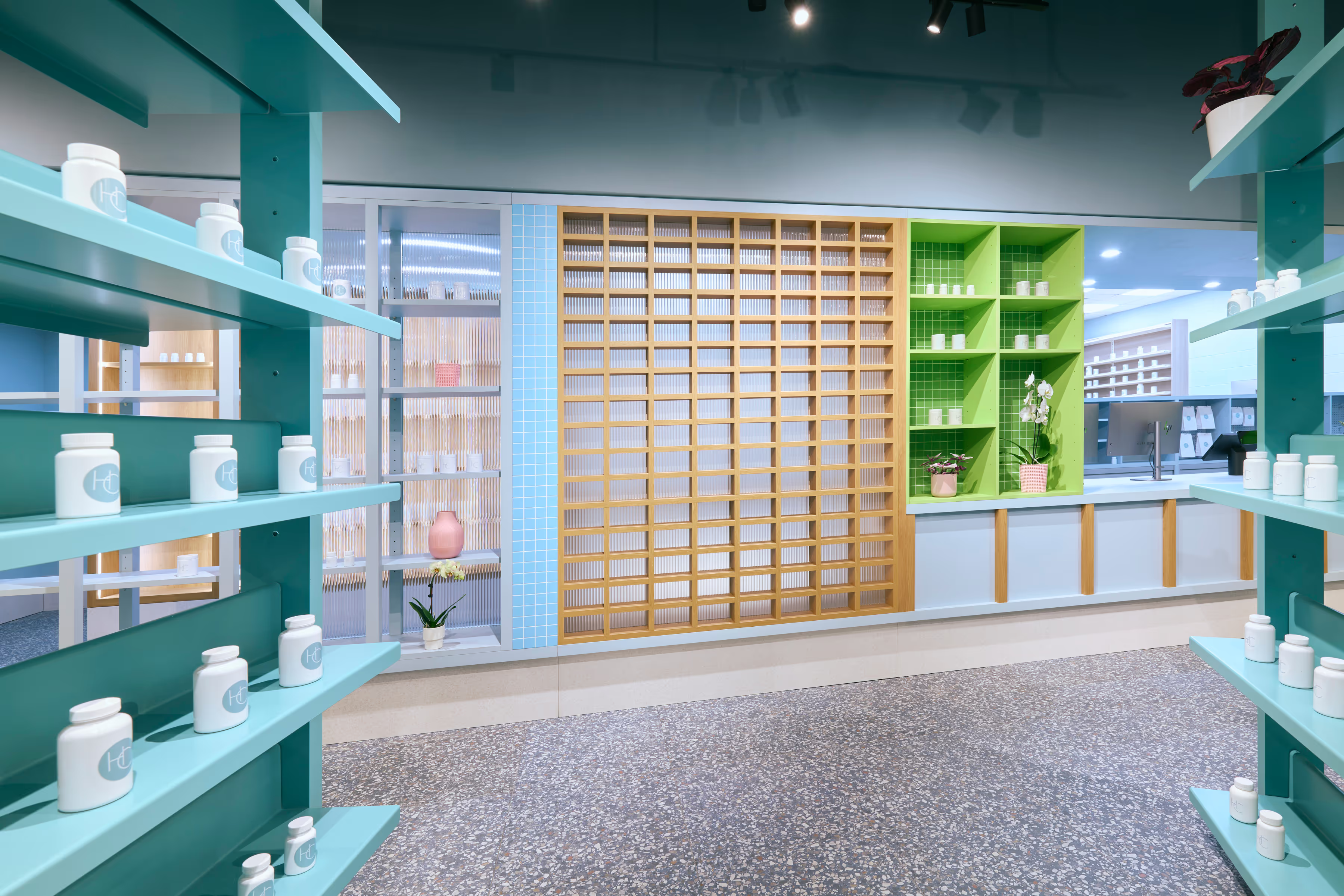
When Health Choice Pharmacy asked us to design their new location on Surf Avenue in Coney Island, the first thing we talked about was what it means to walk into a place that's supposed to help you feel better, and what you actually feel when you enter most North American pharmacies today.
The store is 2,471 square feet on a stretch of Brooklyn with its own particular energy: the boardwalk right next to the famous Luna Park, the ocean a few blocks away, and a neighborhood that's been through a lot over the years. The design had to carry some of that energy and project optimism, something the majority of pharmacies are lacking.
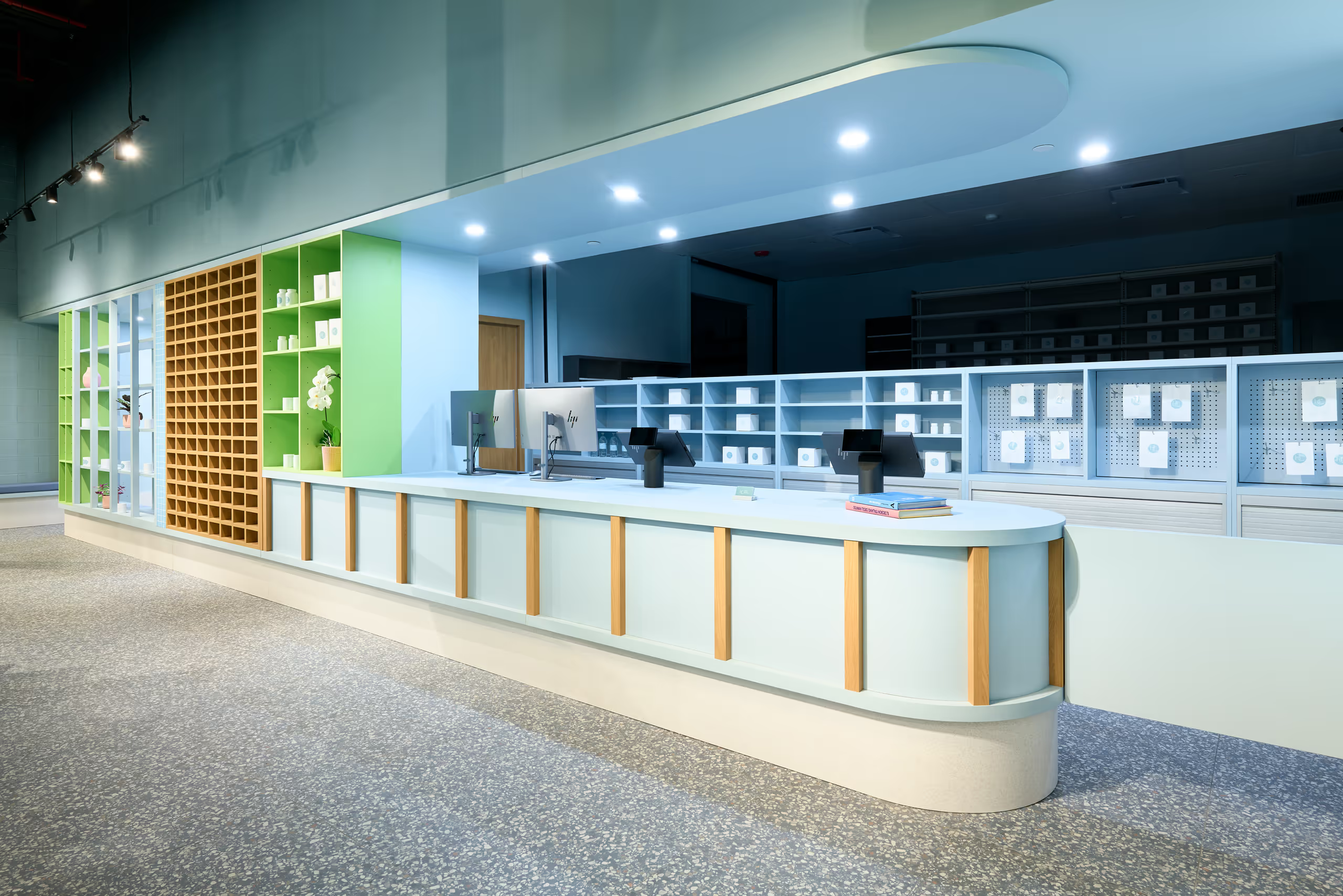
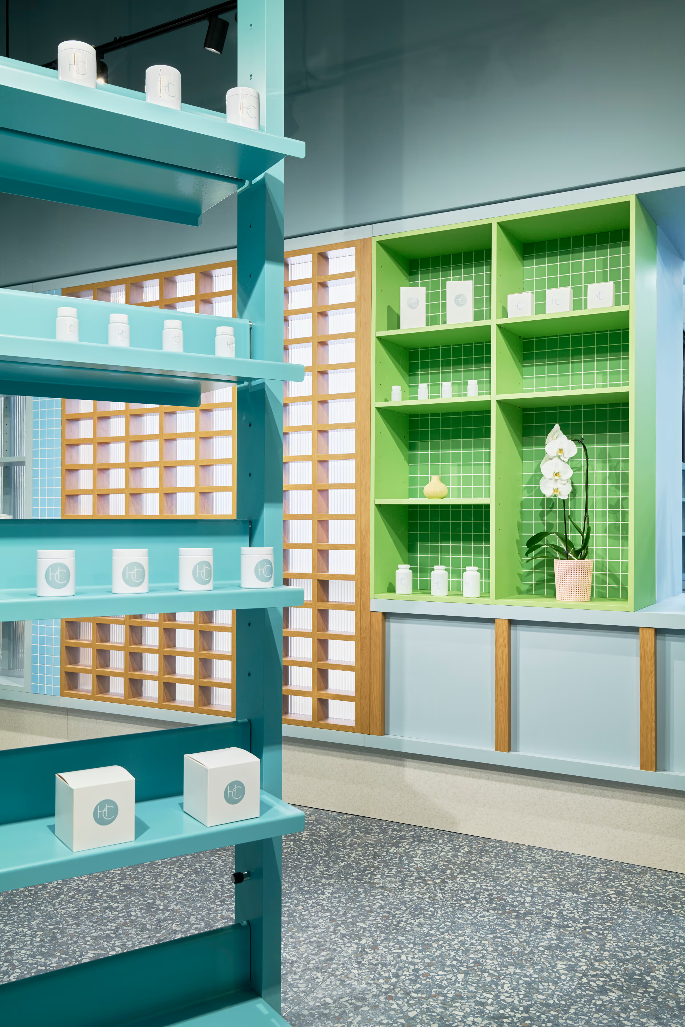
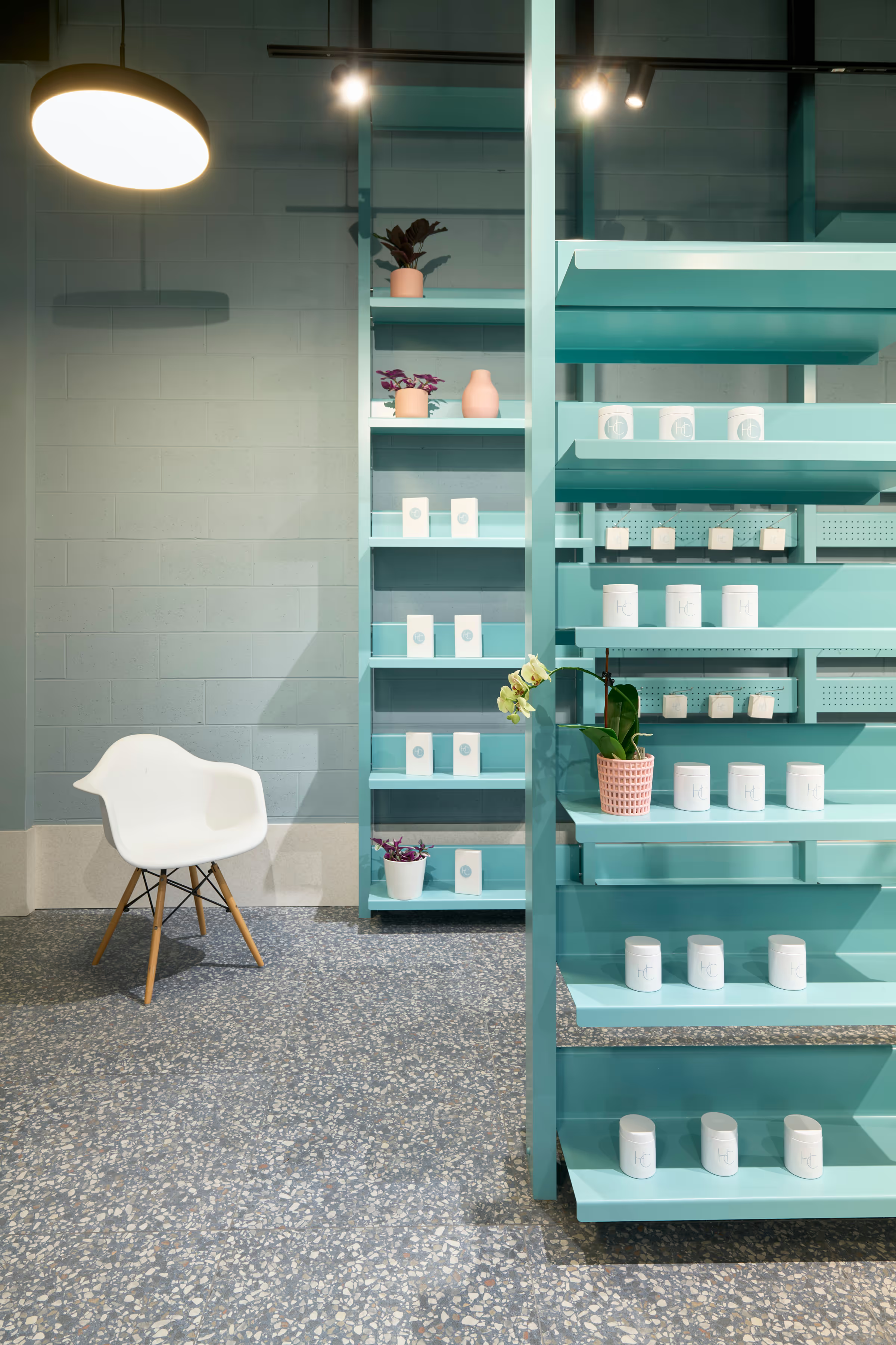
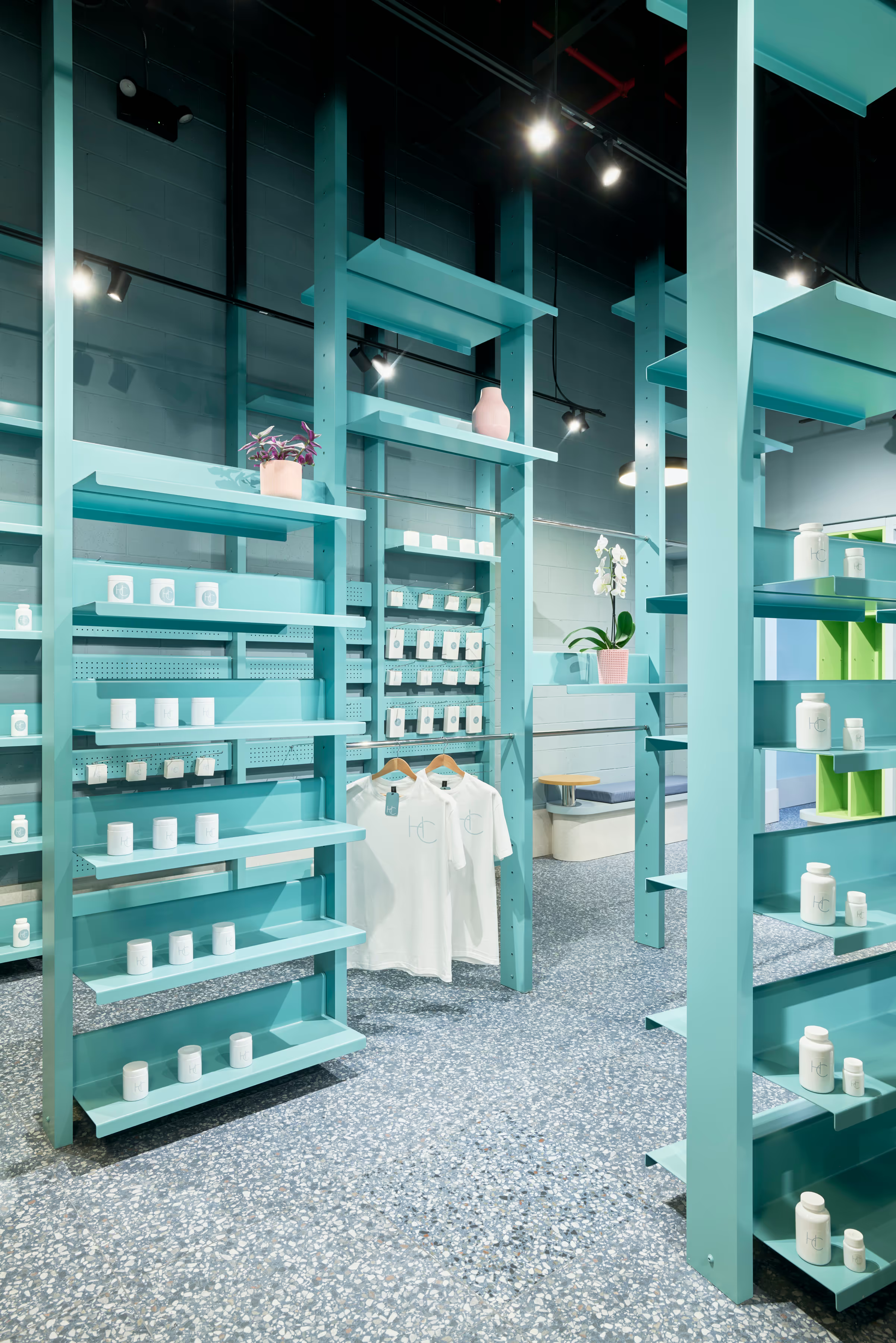
The shelving system was the hardest problem to solve well. Standard pharmacy gondolas work for storage but are heavy, closed, and block every sightline in the store. The system we designed is open and light, with slim metal frames that nearly reach the store's 22-foot (6.7m) ceiling and match the brand's colors, fading to black at the top, slowly dissolving into the black ceiling. From the entrance, you can see across the whole store, through the shelving, to the pharmacy counter. From the counter, the pharmacist has a clear view of everything, without relying just on security cameras. The system is flexible, so it adapts as needs change over time. The shelving comes from what Italians call "librerie svedesi", an open, floor-to-ceiling type that originated in Scandinavia in the late 40s and became a staple of Italian design in the 1950s, most famously in Franco Albini's version. The focus is openness and beauty.
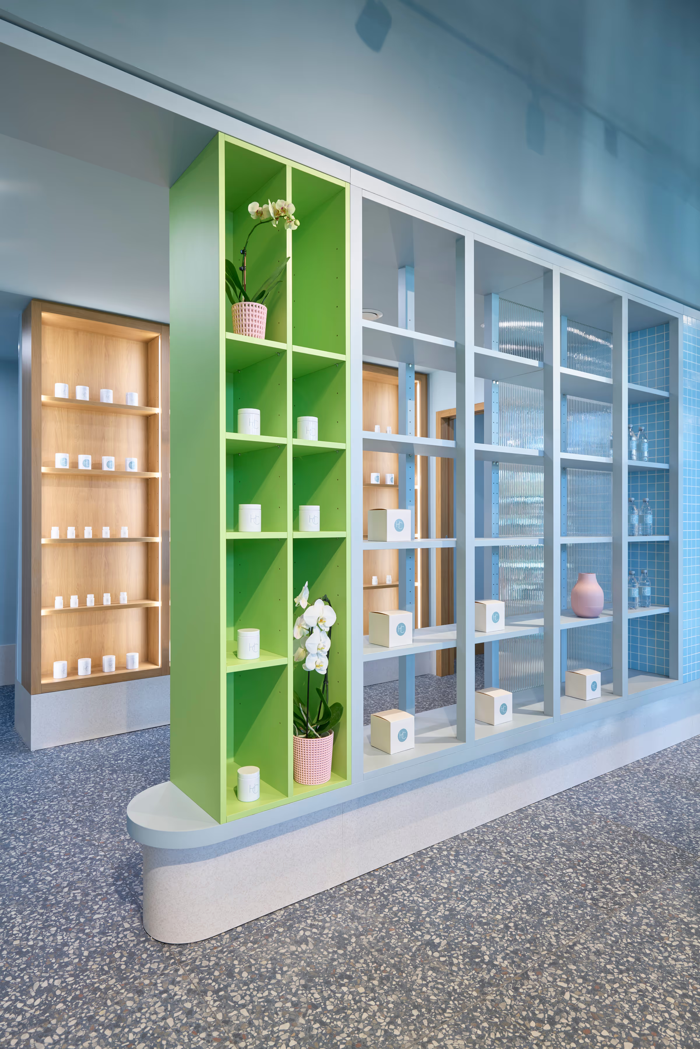
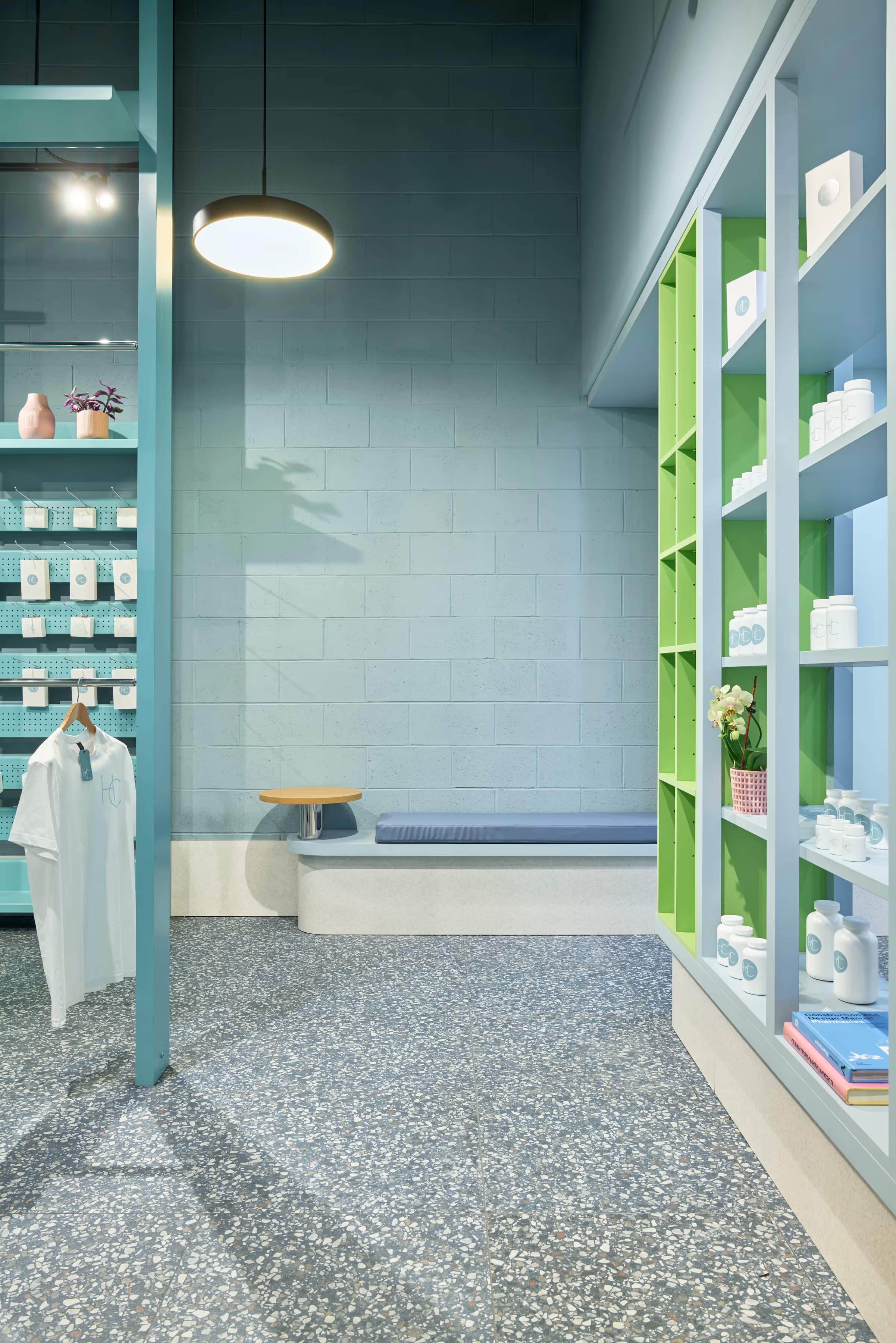
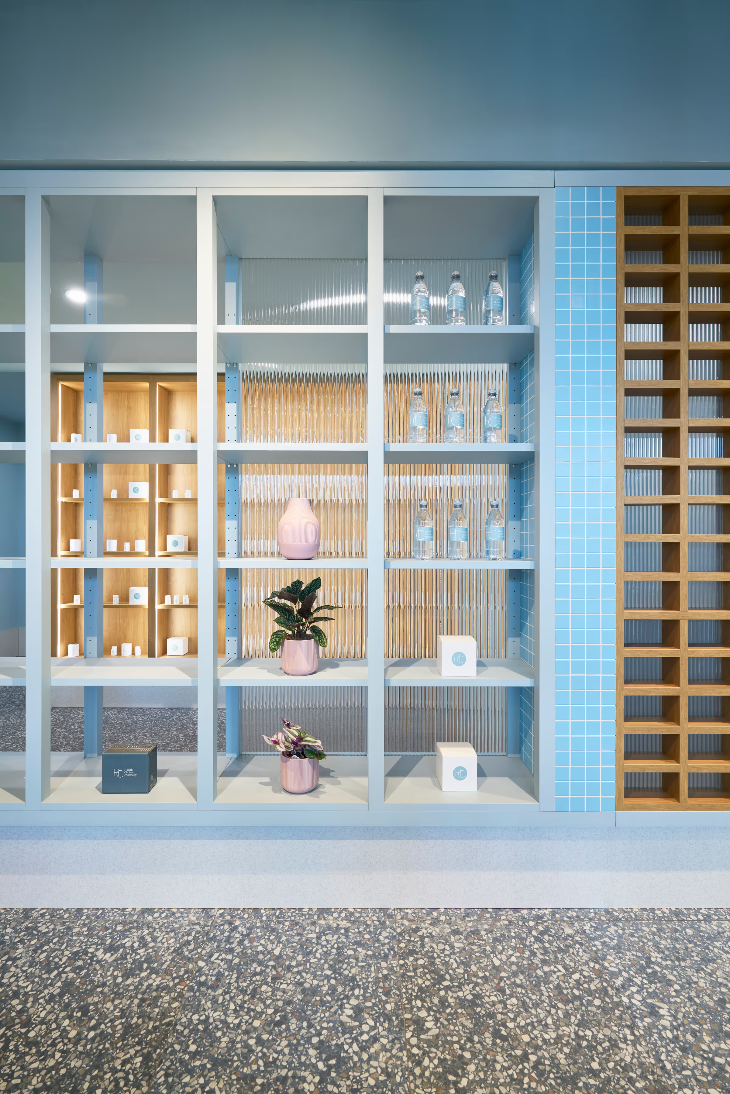
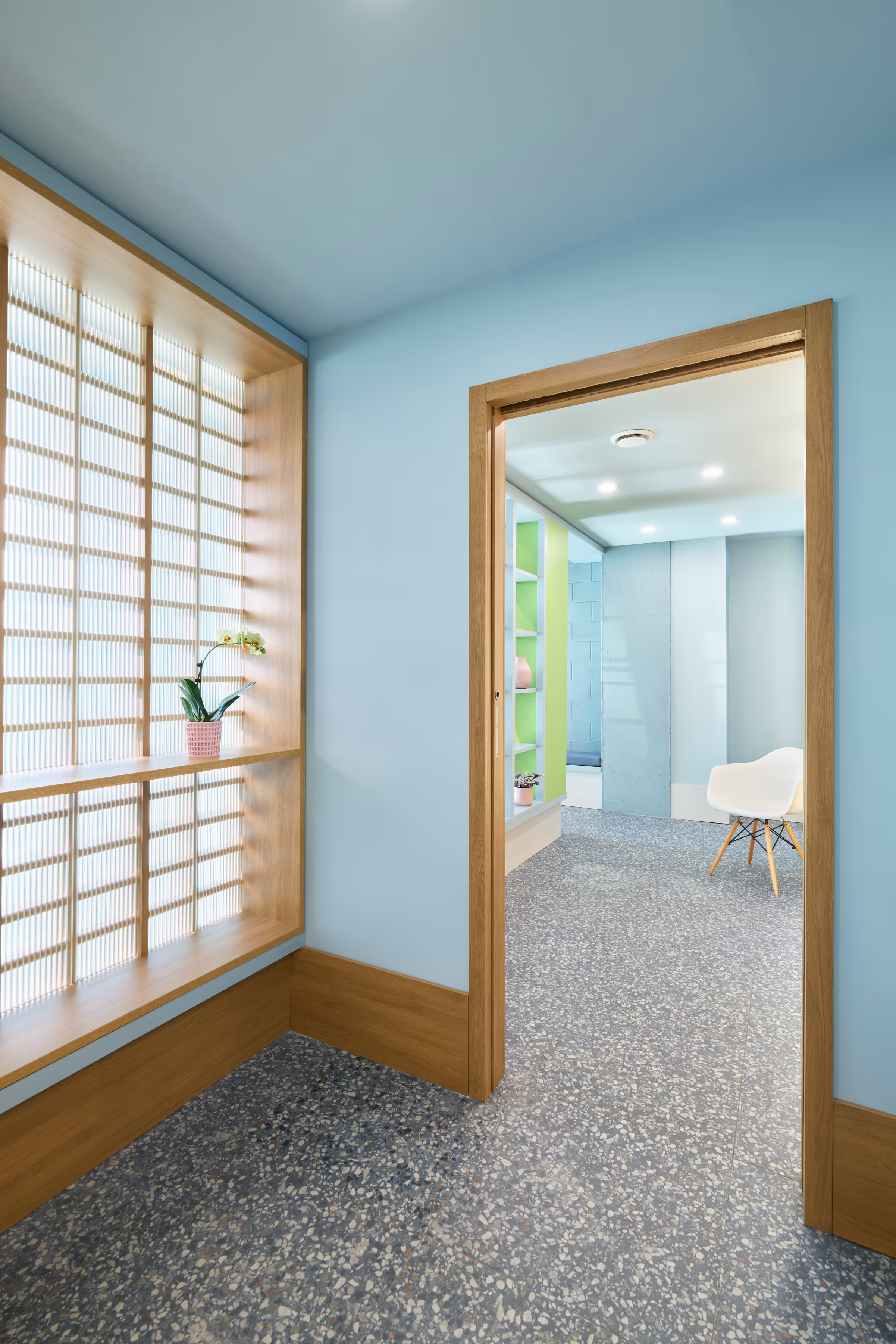
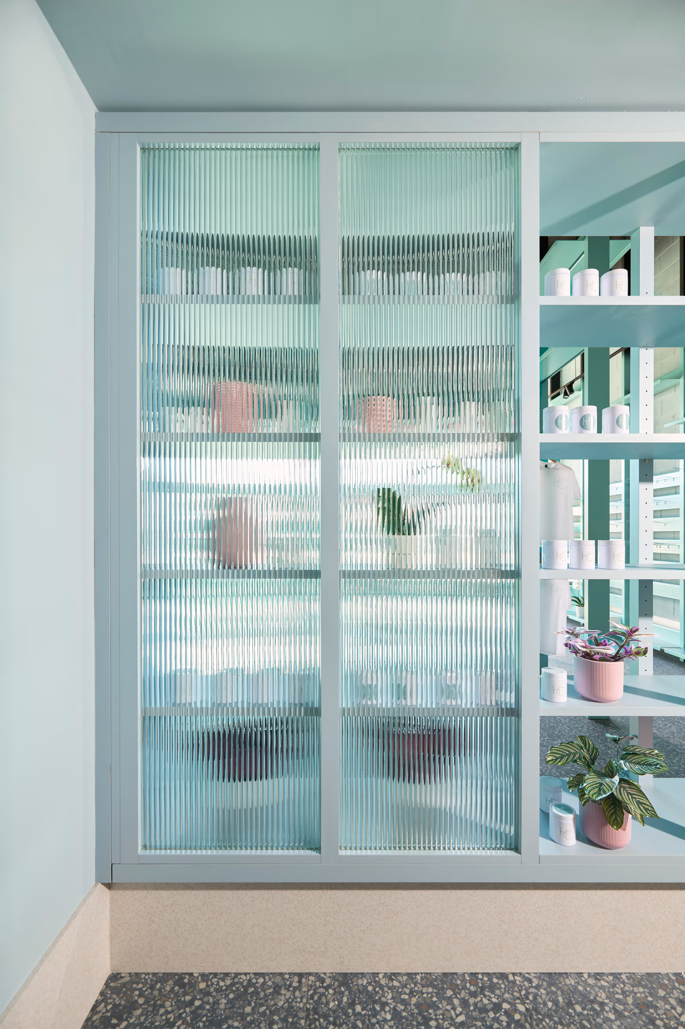
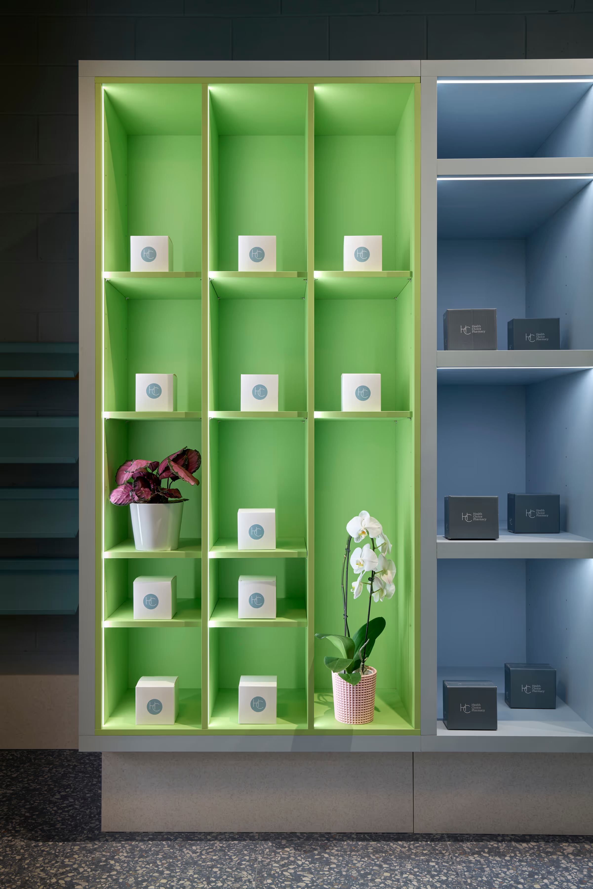
Sky blue and chartreuse green, the two colors that define the brand, run through every fixture and surface in the store. They are the structure of the design. The material palette carries the rest: blue and green laminate on the fixtures, natural oak at the counters and in the consultation room, reeded glass for depth, blue terrazzo on the floor, small-format mosaic tile behind the displays on the counter. The pendant light above the waiting area is the Bobber by Blu Dot, matte black, sitting against a dark ceiling that gradually fades into the blue of the walls. Light does a lot of the work here. Instead of the flat, uniform fluorescent most pharmacies settle for, the lighting is layered: ambient to see by, accent on the product zones, warm-temperature fixtures so the place feels inviting rather than clinical.
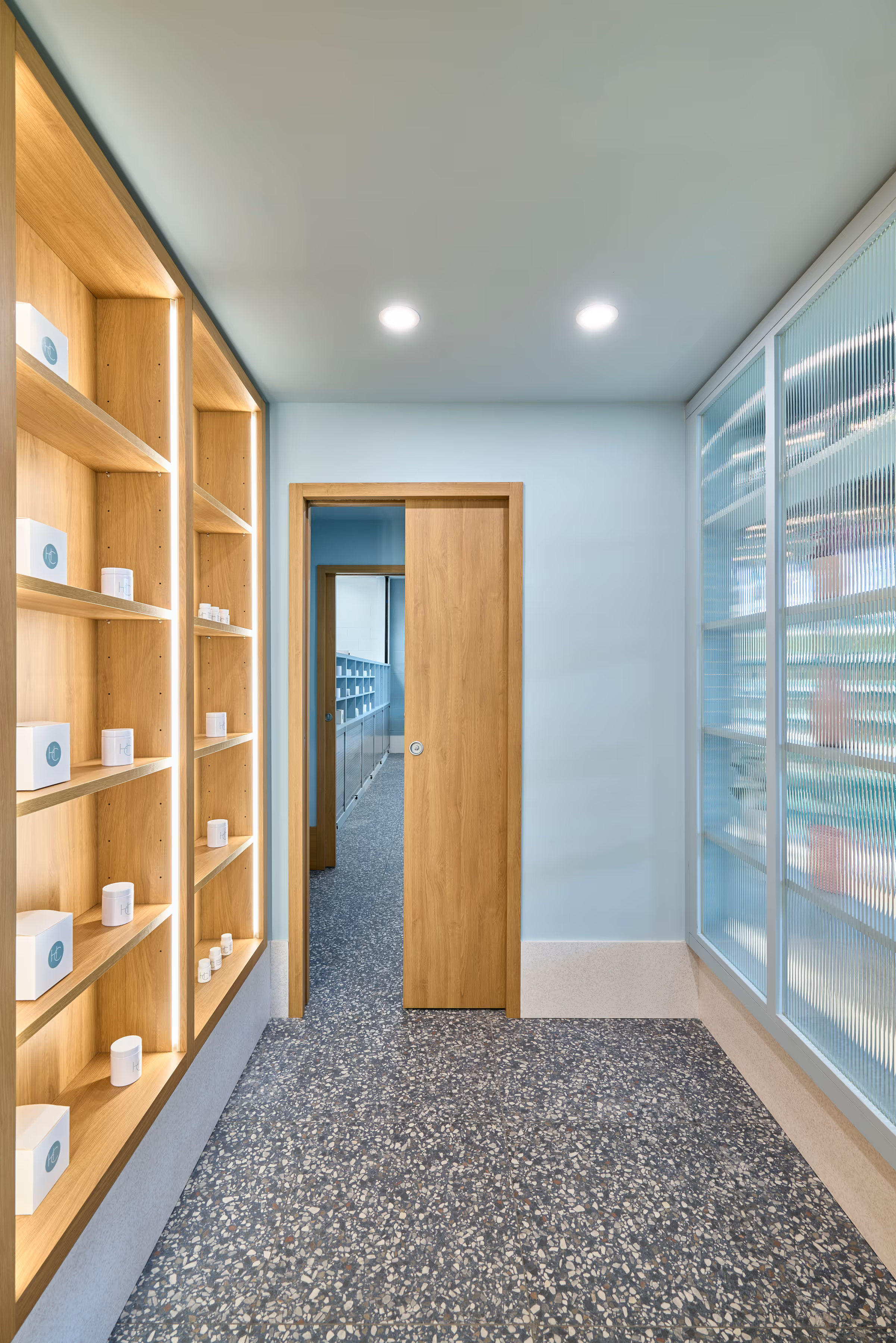
The consultation room is where trust happens. People expose their issues and feel most vulnerable, so the room has to feel safe, not like a closet or an afterthought. The walls are reeded glass, letting the light come through without exposing any detail to the outside. Oak and blue accents, the same palette as the rest of the store, so the room feels like part of the entire space. The room feels private and professional. A place where you'd actually want to have a conversation about your health. Overall, hopefully, a place that will make people feel better. Form follows emotions.


.avif)