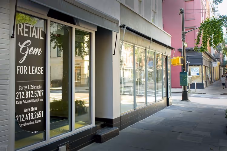
.svg)

A retail store layout is often treated like a technical drawing: where do the fixtures go, how wide do the aisles need to be, how many linear feet of merchandising can be claimed. This approach creates stores that work but still underperform and do not support the overall brand’s identity. Because a layout is not a floor plan. A layout is the behavior the plan produces.
A layout decides whether customers glide through the space or hesitate at the entrance. Whether they understand what the store is selling within ten seconds or feel uncertain and leave. Whether the store feels premium, curated, and calm — or busy, confusing, and cheap, even when the materials are expensive. You might have heard that people judge you in the first 5 seconds after they meet you. In retail, these 5 or 10 seconds are the most vital to your brand’s perception, and the first impression sticks for a very long time.
This is why retail store layouts remain one of the most underestimated levers in modern commerce. Shopping behavior has changed radically — people visit stores to confirm what they saw online, to kill time, to socialize, to try something on, to pick up and return products, to take content, or to buy quickly and leave. Rarely do they follow the old textbook sequence of enter → browse → select → pay → exit.
Let’s look at what this really means, in a way that works for any brand, store size, or budget.
What a Retail Store Layout Really Is (And Why Floor Plans Aren’t Enough)
A space is just a geometric shape, but a place is about the people in it. In the same way, a floor plan is about geometry, while a retail store layout is choreography and storytelling.
You can have a beautiful plan that fails the moment it meets real customers because it ignores what layouts truly should contain: merchandising hierarchy and density, service planning, and brand storytelling.
A strong layout integrates five invisible systems:
1- Circulation
The path logic of the body. Where customers naturally drift, where they avoid, where they accelerate, and where they slow down. Most stores accidentally train customers to move too fast, turning the store into a corridor rather than a shopping environment.
2- Merchandising logic
The sequence of discovery. What’s visible first, what becomes visible later, what draws people deeper, what creates the feeling of choice without saturating the mind.
3- Service logic
Where help appears — without becoming pressure. Some brands require high-touch guidance. Others depend on self-led exploration. Either way, the layout should make assistance appear reachable, not invasive.
4- Operational logic
How staff replenishes, cleans, prevents shrink, manages returns, and survives peak hours without destroying the aesthetic. If operations are ignored, the store slowly deteriorates in everyday life. Visual clutter appears. Bottlenecks become permanent. The space begins to look “designed” in the wrong way — like a showroom struggling to function as a store.
5- Brand messaging
This is the most important of the five systems, and it’s the one that stays with customers longest, imprinting itself in their subconscious. You are telling a story, and every interaction between the brand (including its employees) and the customers adds a brick to this foundation.
Once you see a layout like this, a new truth becomes obvious: the best retail store layouts don’t “look efficient.” They feel meaningful.
The First Ten Seconds: Why the Entrance Zone Controls the Entire Store
The start of the store is the most important part, but it’s often overlooked.
Customers need a few seconds to get used to the store. Their eyes adjust to the lighting, their minds take in the size of the space, and they slow down from walking outside to shopping inside. That’s why the first part of a store is called a decompression zone—a transition area where people aren’t ready to focus on products yet.
Many stores fill this area with products, but customers often ignore it or feel overwhelmed. This is where layout design becomes psychological. The entrance should quickly communicate three things:
- What this store is
- How to move through it
- What kind of experience to expect
You don’t need signs everywhere to do this. What matters is clear space. Lighting should feel welcoming, not harsh. The first thing customers see should show the store’s identity, not a display of products.
If the entrance is confusing, the rest of the layout can’t fix the experience. Most customers won’t keep exploring—they’ll just think, “This place isn’t for me,” and walk out.
Retail Layout Is About Engagement
Many people think a good layout should make customers walk through the whole store. But this strategy often creates paths that feel forced and make shoppers feel manipulated. A better approach is to design layouts that make moving around and exploring feel rewarding.
Customers need reasons to wander: anchors that feel worth approaching, moments of surprise that feel intentional, and so on. Clear “following actions” that don’t require mental effort.
In practice, top stores use a few layout techniques to achieve this, even if they don’t always name them:
The “power wall”
When customers walk in and turn—usually to the right—the first main display wall becomes the focal point. It’s not just for best-sellers. It should convey what the store stands for: its character, values, and what makes it unique.
If that wall is weak, the store starts weak.
Speed bumps
A speed bump is something placed to slow down fast movement, like a table, special display, or new product area. It helps customers pause naturally, letting their attention settle and interest grow, without making them feel blocked.
Without speed bumps, customers move too efficiently and discover too little.
Anchors
Anchors give customers reasons to explore further. They might be standout product categories, special lighting, a service area, a signature collection, a unique scent, a change in materials, or a social spot. Anchors shouldn’t feel like afterthoughts placed in the back just to attract people.
Customers can sense when they’re being dragged.
A good layout invites people to explore without feeling staged or forced.
The Main Retail Store Layout Types (And When They Actually Work)
You’ll find lots of lists of layout types online. Many guides get the details right but miss the main idea: you don’t pick a layout from a menu. You choose it because it fits your customers, products, and business model. Often you have to build your own.
Here’s how to view the most common retail store layouts through the lens of performance.
Grid layout
Grid layouts are common in grocery stores, pharmacies, convenience shops, and value retailers because they make shopping fast, stocking easy, and products dense. They center on simplicity and consistency, making it simple to manage inventory and predict customer behavior.
Grid layouts work best when customers come in with a clear goal, like refilling or buying quickly and leaving. They’re less effective for premium brands that want to sell emotion, craftsmanship, or identity, since grids can make the store feel more generic.
If a luxury brand uses a grid layout (rarely), it should soften the look with wider aisles, fewer products, well-planned lighting, and less of a warehouse feel.
Racetrack / loop layout
A loop layout creates a clear path that guides customers around the store. This helps them see more product categories and encourages discovery. Department stores have used versions of this for years, and many lifestyle brands use it well.
But there’s a risk: if the loop is too rigid, customers feel trapped. If it’s too loose, it loses purpose. The key is to make the loop feel inviting, not restrictive.
Free-flow layout
Free-flow layouts are common in modern fashion stores, galleries, beauty flagships, and experience-focused shops. They promote discovery and, when done right, make the brand feel confident and calm.
However, free-flow layouts can fail if not planned carefully. They need clear organization and a thoughtful merchandising plan. Without strong anchors and easy-to-follow paths, customers may wander and leave without buying.
Boutique / shop-in-shop layout
Boutique layouts break the store into “rooms” or moments, often with distinctive fixtures, lighting, and category identity. This increases dwell time and perceived premium value, and works especially well for multi-brand retail or brands with multiple sub-identities.
The risk is that the store can feel fragmented. If customers can’t get a sense of the whole space at once, they may feel unsure. The main path should still make the layout easy to understand.
Hybrid layouts
Most successful stores today use a combination of layout styles, including:
- a clear main path
- curated free-flow moments
- structured replenishment zones (often grid-like in disguise)
- service points placed as anchors
Hybrid layouts fit today’s shopping habits because people don’t shop in just one way and often visit the store for the experience, not to buy. They buy online from the comfort of their home.
Store Layout Design by Square Footage (Where Most Brands Misjudge the Problem)
You can’t design a 400-square-foot boutique the same way you would a 3,000-square-foot store. Yet many brands try, and then wonder why the space feels too crowded or strangely empty.
Small stores need to be simple and engaging. They frequently fail if they try to offer too much. The optimal way is to offer fewer categories, keep things organized, and tell a strong story. A well-curated small store feels more premium. You can’t sell everything, so focus on one category or message.
Mid-size stores need a sense of rhythm. They should have areas for quick shopping, slower browsing, discovery, and rest. Without this variety, the store can feel dull, and customers may get bored and leave.
Large stores need clear navigation and ways to manage customer energy. Long walks should feel worthwhile, so you need several anchors and smaller destinations throughout the space. If a large store only has one main area at the front and empty spots elsewhere, it won’t work well.
The size of the store affects more than planning; it also shapes how people feel and behave inside.
Checkout and Service: The Conversion Zone Everyone Designs Too Late
In many projects, checkout is designed after the “pretty part.” That’s backwards.
The checkout zone is where customers experience the brand’s final truth: whether the store is elegant or stressful, calm or chaotic, generous or impatient. It is where queues form, frustration grows, and impulse sales either happen naturally or feel like pressure.
Placement matters. A checkout near the exit supports fast transactions but facilitates robberies. A checkout deeper inside can increase browsing and is safer for employees. Neither is universally correct — it depends on category, brand tone, and city environment.
What matters is that checkout is treated as part of the layout choreography, not a cashier dropped into empty space. Its placement needs to be discussed and analyzed.
The Biggest Shift in Retail Store Layouts: People Don’t Shop in a Straight Line Anymore
The classic customer journey assumes a narrative: entrance → browsing → selection → purchase. Modern customers behave differently. They oscillate. They split attention. They interrupt themselves. They compare online while standing inside the store. They leave and return. They ask questions at random points. They buy without touching products. Or touch everything and buy nothing. Older layout thinking no longer applies to this type of customer.
The layout must support non-linear behavior without feeling random or disorganized.
That means more than providing QR codes. It means designing:
- comfortable pause zones
- visible service touchpoints
- intuitive circulation loops for return visits inside the same trip
- clear category landmarks so customers can relocate what they saw five minutes earlier
The best retail store layouts today work like a website, making it easy for people to find their way around without much effort.
What Makes a Layout Fail (And How to Diagnose It Fast)
Most layout failures follow a few patterns.
Some stores are too efficient: customers circulate quickly, discover little, and leave without connecting emotionally with the brand.
Some stores are too dense: the environment becomes visually noisy, customers feel tired, and choosing becomes challenging. They find many items they like, but cannot decide what to buy and leave empty-handed.
Some stores are too open: the space looks premium but feels empty, and customers lose the sense of product richness.
Some stores have weak anchors: there’s no reason to walk deeper, so the back half underperforms and becomes a clearance cemetery.
Some stores create bottlenecks: narrow aisles, awkward fixture placement, or poor queue planning turns peak hours into discomfort. Customers blame the brand, not the plan.
You can measure layout success if you know what to watch for. You don’t need expensive research to start; you just need to pay attention to how people move, where they pause, what they ignore, and where they ask for help.
Final Thought: Retail Store Layouts Are Brand Strategy in Disguise
A layout always communicates something: price level, confidence, trust, quality, pace, inclusivity, service attitude. Even when a brand says nothing, the space is communicating at a subliminal level.
That’s why the best store layout design begins by asking the kind of behavior a brand deserves. When the layout answers this question clearly, customers don’t need extra guidance; they just understand the store, and shopping feels natural. Getting that right is the core of retail store design, where layout, brand, and customer behavior are shaped together rather than in isolation.