.svg)


Pharmacy Design FAQ: Real Answers to the Questions We Hear Every Time
When pharmacy owners reach out about designing a new space or renovating an existing one, the questions are almost always the same. Cost, layout, competition from the chains, lighting, branding — and whether design can actually move the needle in a business this regulated.
These are fair questions. And they all point to the same underlying problem: most pharmacies were put together functionally, not designed thoughtfully. The space works just well enough. But it misses the chance to build trust, make daily operations smoother, and give people a reason to keep coming back.
The questions below come straight from conversations with clients over years of working on independent pharmacies. The answers are grounded in what actually happens when design is done right — and what goes wrong when it isn't.
FAQ 1 — How much does pharmacy design cost?
It depends on size, location, and scope — but the more useful frame is to think of it as an investment rather than a line-item expense.
A full project covering branding, interior design, custom details, permitting, and construction will vary widely. What doesn't vary is the cost of doing it wrong: a generic space that doesn't stand out, doesn't earn loyalty, and doesn't function well is expensive in ways that don't show up on an invoice.
A well-designed pharmacy becomes memorable. It attracts customers who care about quality, not just convenience. It can become a genuine neighborhood landmark. The real question isn't "how much does design cost?" It's "what does a forgettable pharmacy cost you over ten years?"
FAQ 2 — What makes a pharmacy design successful?
When people want to come back — not because they have to, but because the experience is genuinely good.
That means the space does several things at once. Customers understand immediately where to go. The atmosphere feels calm rather than stressful. Staff can move and work efficiently. The brand is clear and consistent. And the whole place feels like it belongs to the neighborhood rather than a corporate template.
Design can't treat illness. But it can make healthcare feel more human. That's not a small thing.
FAQ 3 — Should I hire a designer or just use a contractor?
Most pharmacy owners who ask this question have already gotten a contractor quote. It's lower than expected, the contractor has done pharmacies before, and the whole thing feels straightforward. The designer starts to look like an optional upgrade — nice if the budget allows, easy to cut if it doesn't.
That framing is worth examining, because it assumes the contractor and the designer are doing roughly the same job at different price points. They aren't.
A contractor's job is to build what's in front of them. They're skilled at that, and a good one is genuinely valuable. But they're not trained to ask whether the layout makes sense, whether the shelving height is killing the atmosphere, whether the lighting is doing anything for the brand, or whether the space will still feel right in eight years when the business has evolved. Those questions aren't in their scope. They'll make decisions about all of those things — every contractor does, by default — but they'll make them the way they always have, which usually means replicating whatever they built last time.
What an architect or experienced retail designer actually adds is the thinking that happens before the drawings. The floor plan that considers how customers actually move through a space. The material choices that hold up without looking institutional. The counter placement that makes the pharmacist visible and approachable rather than hidden behind a wall of shelving. Small decisions with large consequences, most of which get locked in early and are expensive to undo later.
The contractor quote looks cheaper at the start. The question is what it costs by the end.
FAQ 4 — What's the best pharmacy layout?
One where you can see across the whole space the moment you walk in.
The standard pharmacy layout borrows from supermarkets: long parallel aisles, tall shelving, sightlines blocked everywhere. It's disorienting for customers and makes it hard for staff to notice when someone needs help.
Better layouts are built around openness. Clear paths from the entrance to the pharmacy counter. Product sections organized by category, not crammed together. The counter itself as a visual focal point, not hidden in the back. Shelving that's modular and adaptable as the business changes.
It's not complicated. Most pharmacies just haven't prioritized it.
FAQ 5 — How do I compete with CVS and Walgreens?
By being the opposite of them.
Chain pharmacies compete on price and convenience. You can't out-convenience a CVS. You're not trying to. Your advantage is the experience, the relationships, and the fact that you're actually part of the community rather than a corporate outpost.
That means better design. Personal service where customers know the pharmacist by name. A pharmacy brand identity that's specific and recognizable. A space people genuinely like being in.
Stop trying to be a smaller CVS. Be something different. That's the only version of this you can win.
FAQ 6 — What's the biggest mistake in pharmacy design?
Copying the chain pharmacy look and expecting a different result.
Independent pharmacies hire contractors who replicate what they've seen: tall blocking shelves, fluorescent lighting, clinical white walls, no real thought behind any of it. Then they're surprised when the space doesn't feel special.
The second most common mistake is generic "wellness" branding — green leaf graphics, faux wood panels, vaguely spa-like details. It looks dated almost immediately and doesn't communicate anything specific about who you are.
Real pharmacy design requires actual decisions: about how the space flows, how it feels, what materials you use, what the brand is actually saying. It's not about buying off-the-shelf fixtures and adding a logo.
FAQ 7 — Should pharmacy design follow healthcare or retail principles?
Retail. Without question.
Pharmacies are neighborhood retail businesses that happen to sell healthcare products. Designing them like clinical facilities — sterile, white, institutional — makes no sense for a space where people also buy shampoo and vitamins.
Retail design principles apply: clear branding, intuitive navigation, a welcoming atmosphere, good materials, good lighting. Then you layer in the pharmacy-specific requirements — secure prescription areas, consultation privacy, regulatory compliance.
Functional and beautiful aren't mutually exclusive. They never were.
FAQ 8 — What role does lighting play in pharmacy design?
An enormous one. It shapes everything about how the space feels.
Flat, uniform fluorescent lighting — the default in most pharmacies — makes products look bad and people feel tired. It's one of the fastest ways to drain the atmosphere out of a space.
Good lighting uses multiple sources: ambient light for the overall space, accent lighting on product areas and focal points, task lighting where staff are working. The color temperature matters too — warmer light (around 2700–3000K) feels welcoming; cool white light feels harsh and clinical.
Lighting isn't just about seeing clearly. It creates mood, directs attention, and reinforces the brand. It's worth treating it seriously.
FAQ 9 — Can good design actually help my business?
This is the question underneath all the other questions. Layout, lighting, materials — those are really just versions of this one. And the honest answer requires separating two things that often get conflated: design as atmosphere, and design as strategy.
Atmosphere matters. A space that feels calm and considered makes people more comfortable, and comfortable people behave differently — they browse longer, they ask questions, they come back. That's real and it's measurable in foot traffic and repeat visits over time. But it's also the easier half of the argument.
The harder, more important half is operational. A pharmacy with a well-planned layout moves people through faster. Staff spend less time navigating around bad decisions that got built into the floor plan. The consultation area that was designed for privacy actually gets used, which means the pharmacist is having conversations that build loyalty instead of shouting across a counter. These aren't aesthetic outcomes — they're business outcomes, and they compound.
There's also something less tangible but genuinely significant: what a well-designed space communicates before anyone says a word. People make trust assessments quickly and mostly unconsciously. A space that looks thought-through signals that the people running it are thought-through. That's not a marketing claim — it's just how perception works. In a business where the entire relationship is built on trust, that first impression carries more weight than most owners realize.
The return on good design isn't always immediate and it doesn't show up cleanly in a single metric. But it shows up in customer retention, in staff morale, in the kind of word-of-mouth that actually moves a neighborhood business. It's slow, cumulative, and hard to reverse-engineer once it's working.
Which is also true of bad design, just in the other direction.
FAQ 10 — Should my pharmacy look modern or traditional?
It should feel current — which isn't the same as trendy.
"Traditional" pharmacy design usually means dated: heavy shelving, institutional colors, a look that made sense when pharmacies were semi-medical facilities and hasn't been updated since. That aesthetic signals the past, not care or expertise.
Contemporary pharmacy design uses open layouts, considered materials, and color that's intelligent rather than generic. You can reference familiar ideas — greens, classic symbols, a sense of warmth — without being stuck in an era that's long gone.
The goal is a space that feels timeless rather than fashionable. Those are different things.
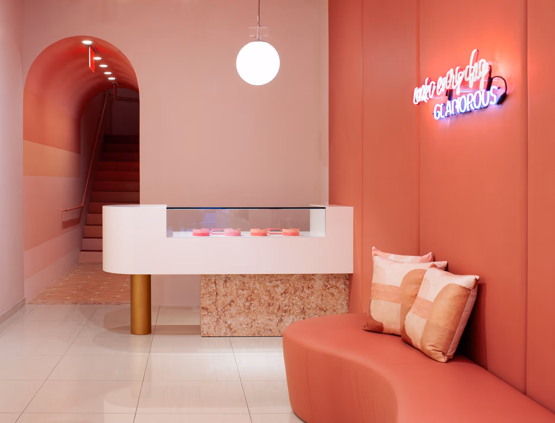
FAQ 11 — What colors work best in pharmacy interiors?
The honest answer is that the wrong question is being asked.
Most pharmacy owners come in asking about color early — before layout, before lighting, before brand. They want to know if they should paint the walls sage green or warm white. But color chosen in isolation almost always lands wrong, because color is reactive. It changes completely depending on the light hitting it, the materials next to it, and the feeling the overall space is already creating.
What actually matters is what you want the space to feel like — and then working backward to color from there.
If the goal is calm, you're generally looking at low-saturation tones: dusty blues, soft warm whites, muted greens that read as restful rather than clinical. If the goal is energy and vitality — a younger customer base, a wellness-forward brand — you have more room to push saturation. If the brand is built around trust and expertise, cooler neutrals with a few precise accents tend to hold up better than anything bold.
The other thing worth saying: most pharmacies are afraid of color, so they default to white. White walls with fluorescent lighting is one of the least welcoming combinations possible. It doesn't read as clean — it reads as unfinished. A considered neutral with warm lighting will always outperform stark white under harsh light.
Pick the feeling first. The color follows from that.
FAQ 12 — How long does a pharmacy design project take?
Realistically, six to twelve months from first concept to opening. Complex sites or significant renovations can take longer.
Concept development and branding typically takes two to three months. Design documentation and permits take another one to two months. Construction and installation runs three to six months depending on scope.
Custom millwork, integrated lighting, branded flooring, and healthcare permitting all take time. That's not a reason to rush or cut corners — it's a reason to plan ahead.
A generic pharmacy can be assembled quickly. A designed one takes longer. But you'll be operating in that space for a decade or more.
FAQ 13 — Can I design my own pharmacy, or do I need professional help?
You can try. But the result will reflect the attempt.
Designing a pharmacy well requires expertise across spatial planning, retail psychology, brand development, material selection, lighting, regulatory compliance, and construction documentation. Most pharmacy owners are deeply skilled at running a pharmacy. That's a completely different skill set.
Trying to do both usually means compromising on both. The pharmacy operations suffer from the distraction, and the design suffers from the inexperience.
Hire expertise where you need it. The investment comes back.
FAQ 14 — What materials should I avoid in pharmacy design?
Walk into any independent pharmacy that feels off and try to identify why. It's rarely one thing. The shelving is a little too industrial. The ceiling does something that makes the room feel lower than it is. The floor has a faint tackiness to it, visually — not dirty, just somehow cheap. Nothing is wrong exactly, but nothing feels considered either.
That accumulation is almost always a materials problem.
The issue isn't that bad materials were chosen. It's that no real choice was made at all. The contractor installed what they install everywhere. The owner signed off on samples that looked neutral and inoffensive. And the result is a space that feels like it was assembled rather than designed — because it was.
So the question isn't really about a list of things to avoid. It's about whether anyone is making intentional decisions at all. A basic material chosen deliberately — painted concrete, honest laminate, simple white tile — will hold up better than an expensive one chosen by default. The eye can tell the difference between a decision and a placeholder, even if the person looking can't articulate why.
Where this matters most in pharmacies is at the points of contact: the floors, the shelving, the counter, the ceiling. Those are the surfaces people actually register. Getting those four things right, with materials that feel considered and consistent with each other, covers most of the ground. Everything else is secondary.
The avoid list exists, but it's almost beside the point. The real question is whether someone is actually thinking about this — or just filling space.
FAQ 15 — Should my pharmacy have a consultation area?
Most pharmacies that have one don't really have one. There's a desk somewhere near the back, maybe a low partition, possibly a chair that doesn't match anything else in the space. It was added because someone said it should be there, and it shows.
That half-finished version is worth thinking carefully about, because it doesn't just fail to help — it actively undermines something. A consultation area that offers no real privacy tells customers that privacy wasn't taken seriously. A chair that feels like it came from a waiting room tells them the conversation they're about to have is clinical, not personal. The details send a message whether you intend them to or not.
The reason to have a consultation area at all is that it changes the nature of the relationship. A pharmacist sitting across from a customer in a space that feels considered and private is having a different conversation than one leaning over a counter with three people in line behind the customer. The physical environment shapes what people are willing to say, what they feel comfortable asking, and how much they trust the person they're talking to. That's not a design theory — it's just how people behave.
Done properly, a consultation area doesn't need to be large or expensive. It needs to feel genuinely separate — visually and acoustically — from the main floor. It needs furniture that feels like furniture, not equipment. Lighting that's warm enough that the person sitting there doesn't feel like they're being examined. A sense that someone thought about what it would feel like to sit in that chair and have a difficult conversation.
That last part is really the test for the whole thing. If you can sit in the consultation chair and imagine a patient talking openly about something private, it's working. If it still feels like a corner of a pharmacy, it isn't.
Further readings:
Check out our other article on Pharmacy Interior Design
18%20.avif)
08a-.avif)