
.svg)

How to Design a Pharmacy (The Part Nobody Talks About)
The first meeting with a pharmacy owner rarely starts where they expect it to. We don’t open with colors, floor plans, or fixtures. We start with something closer to a conversation you’d have with a therapist: Why do you want to open this pharmacy? What keeps you working late without noticing the time? What kind of place do you want this to be in five years?
Creating a new store is almost like going to a psychoanalyst. It’s a process of personal exploration. And until that process is done honestly, the design can’t really begin.
This is the part of pharmacy design nobody writes about, because it feels abstract and it doesn’t fit cleanly into a project schedule, but it’s the part that decides whether the finished space has a point of view or simply a color palette.
Before the floor plan, there is a brand
By the time an owner comes to us, the lease is usually signed. That means rent is already being paid on an empty space, and an opening date is sitting on the calendar. The operational questions, licensing, inventory, insurance, staffing, have absorbed most of the available attention. The question of what the pharmacy actually stands for has barely come up.
And when it has come up, it has usually been understood as a logo and a set of colors. That’s what most owners mean by “brand.” The graphic layer. The sign above the door. Almost no one arrives having thought about brand as the deeper question of what the pharmacy believes, who it serves, and what it owes the people who walk in. A brand is a promise to deliver something; without that promise, you only have a store.
So the discovery session is often the first time anyone has asked them these questions at all. They expect to talk about shelving. Instead we ask them to describe the pharmacy as if it were a car, or a person, or a fashion label. The questions land as a surprise. That surprise is the point. It moves the conversation off the surface, where the logo lives, and down to the level where the real decisions get made.
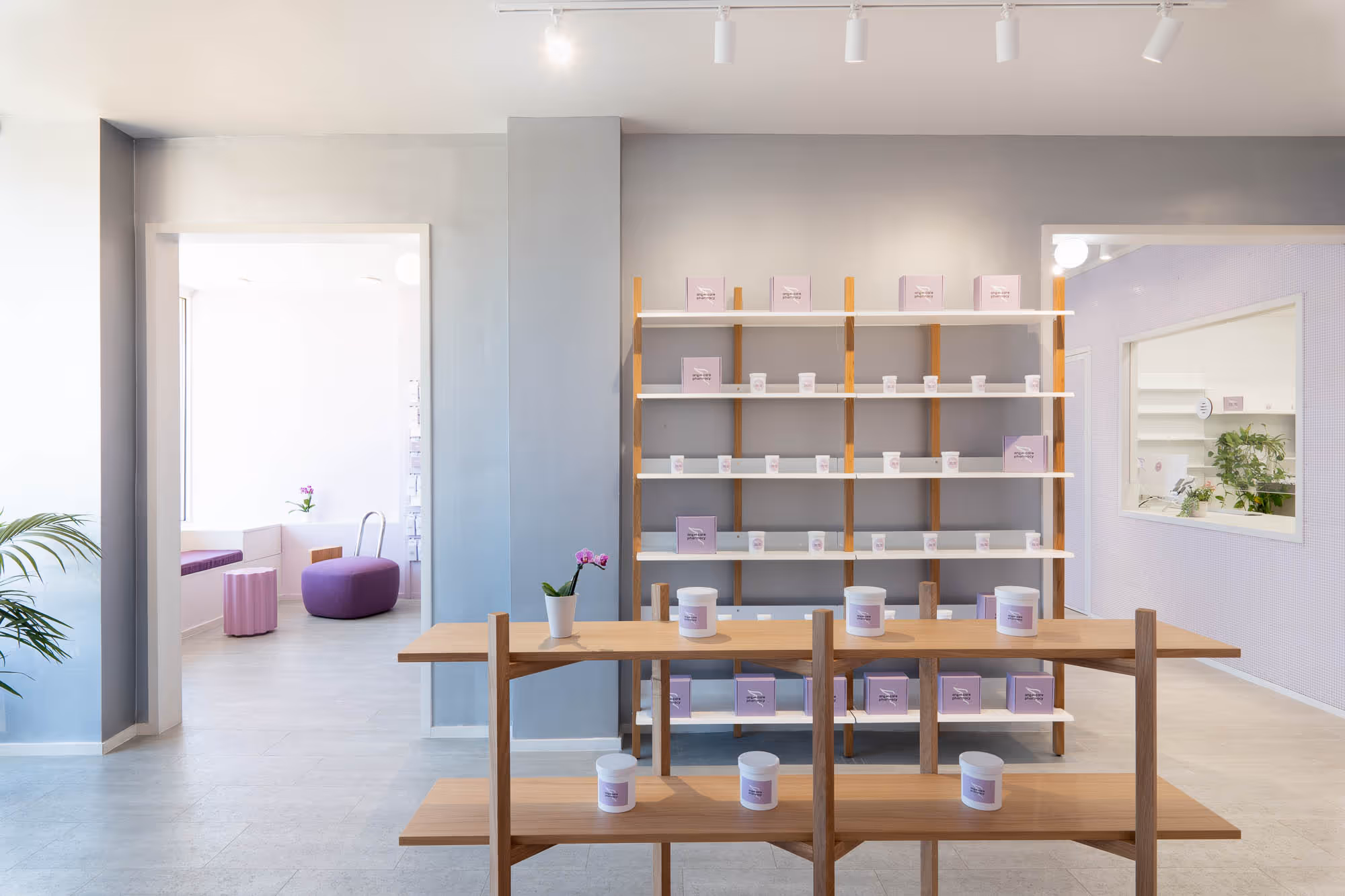
One owner described what they wanted as “Tesla inside, Audi outside.” They offered it half as a joke. But it told us everything: technically sophisticated, visually restrained, quietly premium. That particular phrase shaped every material and spatial decision that came after it.
Why this matters for the design
A pharmacy is a trust environment. People arrive in states of vulnerability: handling a chronic condition, filling a prescription for someone they’re caring for, moving through a health system that has already made them feel small. The space has to answer a question the patient never asks out loud: am I in good hands?
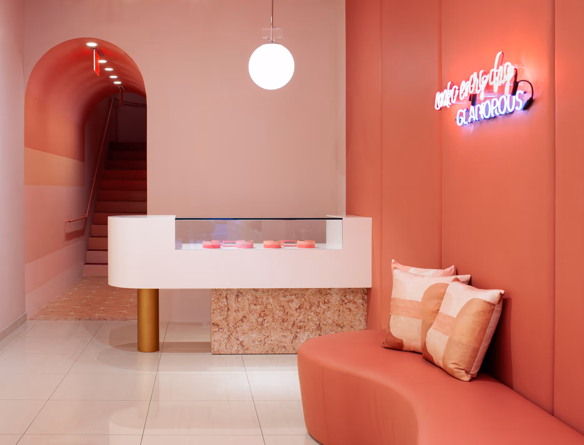
That answer can’t come from a generic interior. It has to come from a space with a specific point of view, consistent from the storefront to the prescription counter to the consultation area. When the brand has been defined properly, the design decisions follow from it. Lighting temperature, materials, signage tone: all of it gets easier when there’s a clear idea of who the pharmacy is.
When the brand hasn’t been defined, the design fills that vacuum with compromises. You get a space that works but says nothing. People use it because it’s convenient, not because it means anything to them. That’s a perfectly functional pharmacy. It’s also indistinguishable from every other functional pharmacy nearby.
The questions that shape the space
The discovery questions change from project to project, but a few come up every time.
What is the pharmacy’s unique position? Not unique in the marketing sense. Every pharmacy calls itself forward-thinking and community-driven. Unique in the specific sense: the one thing this pharmacy does or believes that the one down the street doesn’t. The answer is usually small and concrete. One owner told us they would never stock low-quality products, regardless of margin or demand. That’s a brand position. It shapes what goes on the shelves, how the displays are built, and how the staff talks about what they sell.
Who is the patient you want? Not demographically, but in terms of the relationship. What does this person need from a pharmacy that a chain can’t give them? One owner described their ideal customer as someone who comes in partly just to talk. Their staff knows people by name, knows their families, knows what’s going on in their lives. A pharmacy built around that relationship needs a different physical environment: fewer barriers, softer light, a place to sit near the prescription area. The design followed the kind of relationship the pharmacy wanted to have.
What is the pharmacy fighting against? This one sounds adversarial, but it produces the clearest answers. Most independent pharmacies are fighting the same thing: the impersonal scale of the chains, the transactional model, the old assumption that a private pharmacy is just a smaller version of a big one. When an owner can name that clearly, it becomes the organizing idea for the whole project. The design is the argument, made physical.
This is architectural branding
What we’re describing is architectural branding: the translation of a brand’s identity into physical space, where proportion, material, light, and circulation carry the meaning a logo never can. The graphic identity tells you the pharmacy’s name. The space tells you what it believes.
This is why the discovery has to come first. You can’t translate an identity that hasn’t been formed. And you can’t form one halfway through construction when the budget is set and the contractor is on site. The owners who arrive with the clearest sense of who they are end up with the best projects. Not because they have better taste, but because they’ve given us something real to work from.
What it looks like in practice
The discovery process takes a few hours to a few days, and it happens before any drawings exist. What comes out of it is a shared, specific understanding of what the pharmacy is and what the space needs to say.
From there, every decision has a foundation. The lighting is a consequence. The layout and hierarchy reflect how the pharmacists relate to the customers. The materials carry the character of the brand onto every surface a person touches. If you want to see how that translates into a full project, our pharmacy design work starts from exactly this point.
Most pharmacies skip the step entirely. They go straight to the floor plan and the fixture supplier. The result functions, but it doesn’t communicate; it has no story. It serves people without meaning anything to them.
The ones that start with the harder questions tend to become the pharmacies people actually talk about. Not because they’re beautiful, though they often are, but because they somehow relate to people at a subliminal level. And that connection tends to stay.
.avif)
.avif)
